在开发中,如果没有动画的话,整个页面内容的显示和隐藏会非常的生硬!不好看,为了给予一定的用户体验,进入今天的主题

目录
一、Transition组件
1.Transition组件的原理
进入
离开
2、Transition组件中使用transition
代码
效果
说明
3、Transition组件中使用animation
代码
效果
4、Transition组件的type属性
代码
效果
5、Transition组件的duration属性( 用的比较少 )
基本设置 : 同时设置进入和离开的时间
对象设置 : 分别设置进入和离开的时间
6、 Transition组件的mode属性
代码
效果
缘由和解决
7、 Transition组件的appear属性
8、 Transition组件的回调函数
二、使用animate.css第三方动画库
1.安装
2.导入
3.使用
01-在css中使用
02-使用class类名
三、使用gsap库 ( JS库 )
1.安装
2.导入
3.使用
4.效果
5.gsap额外补充 ( 数字变化效果 )
代码
效果
四、列表的过渡 transition-group
1.列表数字增加删除效果
01-代码
02.效果优化
03.增加洗牌效果
2.列表的交替动画效果
01-用css实现
02-使用js实现动画
五、写在最后
React框架本身并没有提供任何动画相关的API,所以如果需要使用的话可以使用一个第三方库react-transition-groupVue中为我们提供了一些内置的组件和对应的API来完成动画
一、Transition组件
1.Transition组件的原理
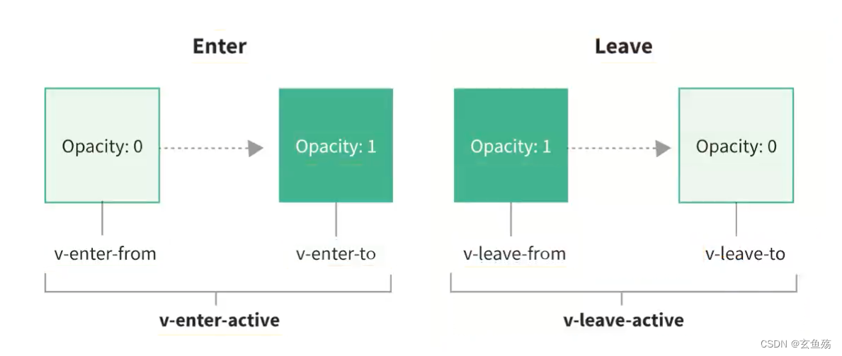
当插入或删除包含在transition组件中的元素时,vue将会做以下处理
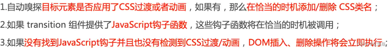
就是 : 会自动把类加入到 transition组件下的根元素中,transition里面只能放单个标签( 组件 )
添加或者删除的class,常用的是如下六个
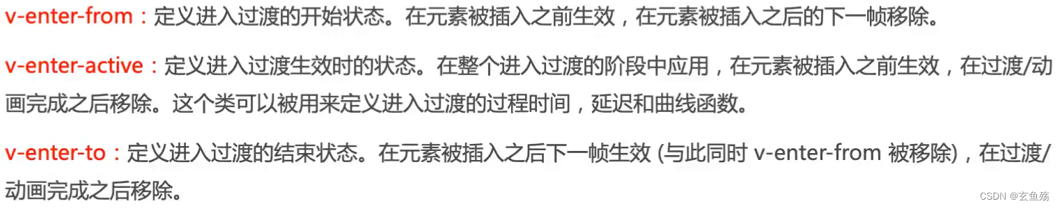
进入 :
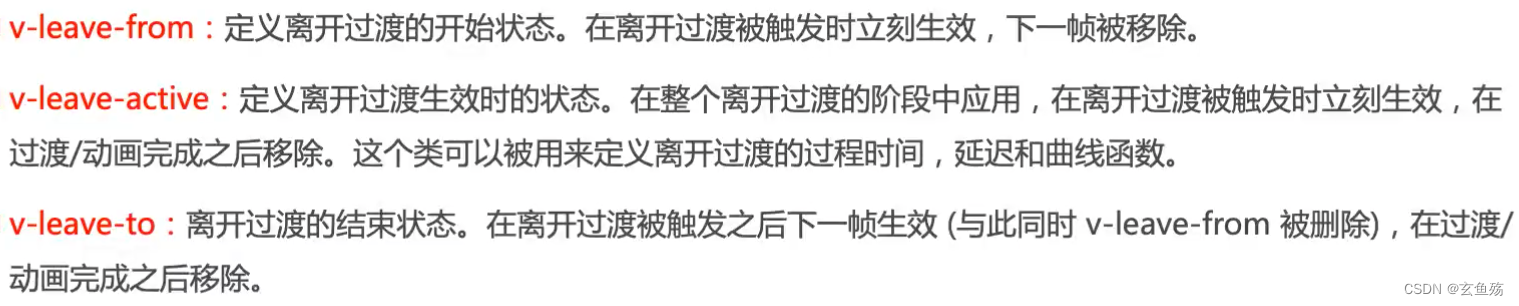
离开 :
2、Transition组件中使用transition
代码
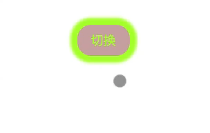
<template> <div class="box"> <button @click="isShow = !isShow">切换</button> <!-- 用 transition 包裹一下,取个名字run,类名的前缀就是run--> <transition name="run"> <!-- 内部元素或组件的显示和隐藏,会触发transition效果 --> <div v-if="isShow"> <span>123123123123</span> </div> </transition> </div></template><script>export default { data() { return { isShow: true }; }};</script><style lang="scss" scoped>// 元素开始进入的状态 | 元素离开结束的状态.run-enter-from,.run-leave-to { opacity: 0;}// 元素进入结束的状态 | 元素开始离开的状态。 这里不写也可以!!!!!!.run-enter-to,.run-leave-from { opacity: 1;}// 元素进入 | 结束时,过渡的效果.run-enter-active,.run-leave-active { // 过渡动画的使用 transition: opacity 2s linear 0s;}</style>效果
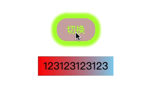
说明
3、Transition组件中使用animation
代码
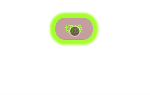
<style lang="scss" scoped>/*** 如果是动画效果,不止一个状态改变* 就只需设置动态jike* */.run-enter-active { animation: run-scale 1s linear 0s;}// 离开的时候设置成相反哒.run-leave-active { animation: run-scale 1s linear 0s reverse;}@keyframes run-scale { 0% { transform: scale(0); } 50% { transform: scale(1.3); } 100% { transform: scale(1); }}</style>效果
4、Transition组件的type属性
发生在 : 当我们同时使用transition和animation的情况下
代码
<style lang="scss" scoped>// 元素开始进入的状态 | 元素离开结束的状态.run-enter-from,.run-leave-to { opacity: 0;}// 元素进入结束的状态 | 元素开始离开的状态.run-enter-to,.run-leave-from { opacity: 1;}// 元素进入 | 结束时,过渡的效果.run-enter-active,.run-leave-active { // 过渡动画的使用 transition: opacity 2s linear 0s;}.run-enter-active { animation: run-scale 2s linear 0s;}// 离开的时候设置成相反哒.run-leave-active { animation: run-scale 2s linear 0s reverse;}@keyframes run-scale { 0% { transform: scale(0); } 50% { transform: scale(1.3); } 100% { transform: scale(1); }}</style>效果
tip : Vue为了知道过渡的完成,内部是在监听transitionend和animationend
如果只使用了其中一个,Vue能自动识别类型和设置监听
但如果同时使用,可能会出现问题:
可能某一个动画执行结束,另外一个动画还没有结束 ( 时间设置的不一样 )解决方案
设置type属性为transition和animation来明确指定告知vue监听的类型,以哪个时间为准<template> <div class="box"> <button @click="isShow = !isShow">切换</button> <!-- 这里指定以哪个时间为标准 --> <transition name="run" type="transition || animation"> <div v-if="isShow"> <span>123123123123</span> </div> </transition> </div></template>题外话 :其实一般设置一样的时间,而且,有动画了为啥要设置过渡呢,是个神奇的属性~
5、Transition组件的duration属性( 用的比较少 )
基本设置 : 同时设置进入和离开的时间
<transition name="run" :duration="1000"> <div v-if="isShow"> <span>123123123123</span> </div></transition>一旦这么使用了,css中设置的 transitionend和animationend的时间就无效了,以duration时间为准
对象设置 : 分别设置进入和离开的时间
<transition name="run" :duration="{ enter: 800, leave: 1000 }"> <div v-if="isShow"> <span>123123123123</span> </div></transition>6、 Transition组件的mode属性
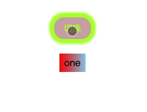
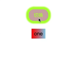
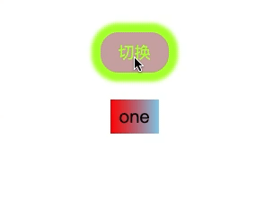
如果transition组件中包裹的是两个元素( 组件 ),相互显示,就会发生很丑的事情
代码
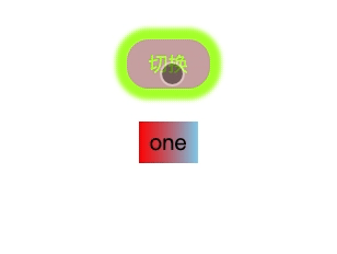
<template> <div class="box"> <button @click="isShow = !isShow">切换</button> <transition name="run"> <div v-if="isShow"> <span>one</span> </div> <div v-else> <span>two</span> </div> </transition> </div></template><script>export default { data() { return { isShow: true }; }};</script><style lang="scss" scoped>.run-enter-active { animation: run-scale 2s linear 0s;}// 离开的时候设置成相反哒.run-leave-active { animation: run-scale 2s linear 0s reverse;}@keyframes run-scale { 0% { transform: scale(0); } 50% { transform: scale(1.3); } 100% { transform: scale(1); }}</style>效果
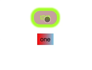
缘由和解决
原因 : 因为默认情况下,进入和离开动画,是同时发生的
解决 : 设置mode属性
<transition name="run" mode="in-out || out-in"> <div v-if="isShow"> <span>one</span> </div> <div v-else> <span>two</span> </div></transition>mode : in-out
mode : out-in
7、 Transition组件的appear属性
如果想要一刷新页面就展示动画,需加上
<transition name="run" mode="out-in" appear> <div v-if="isShow"> <span>one</span> </div> <div v-else> <span>two</span> </div></transition>8、 Transition组件的回调函数
<transition @before-enter="beforeEnter" @enter="enter" @after-enter="afterEnter" @enter-cancelled="enterCancelled" @before-leave="beforeLeave" @leave="leave" @after-leave="afterLeave" @leave-cancelled="leaveCancelled" :css="false"> <div v-if="isShow"> <span>one</span> </div></transition>:css="false". 会让Vue跳过css检测,提高性能,同时防止过渡过程中受css样式的影响
before-enter : 动画进入之前触发 ---- from,初始化操作enter : 动画正在进入时触发 ---- active,写js,执行具体的动画after-enter : 动画进入之后触发 ---- to,结束,收尾工作enter-cancelled : 动画进入失败触发before-leave : 动画离开之前触发leave : 动画正在离开时触发after-leave : 动画离开之后触发leave-cancelled : 动画离开失败触发
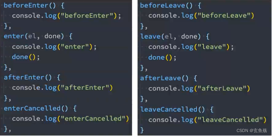
el : 执行动画的那个元素
done : 当使用javaScript来执行过渡动画时,需要进行done回调,否则它们将会被同步调用,过渡会立刻完成
接下来使用其他封装好的第三方动画库啦~

二、使用animate.css第三方动画库
Animate.css | A cross-browser library of CSS animations.
1.安装
npm install animate.css2.导入
在main.js中进行导入
import 'animate.css'3.使用
01-在css中使用
代码
<template> <div class="box"> <button @click="isShow = !isShow">切换</button> <transition name="run" appear> <div v-if="isShow"> <span>one</span> </div> </transition> </div></template><script>export default { data() { return { isShow: true }; }};</script><style lang="scss" scoped>.run-enter-active { animation: lightSpeedInRight 2s linear 0s;}.run-leave-active { animation: lightSpeedOutRight 2s linear 0s;}</style>效果
说明
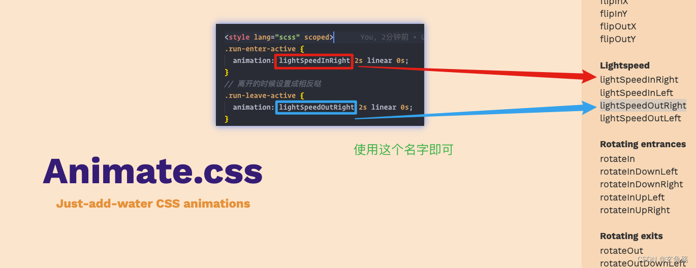
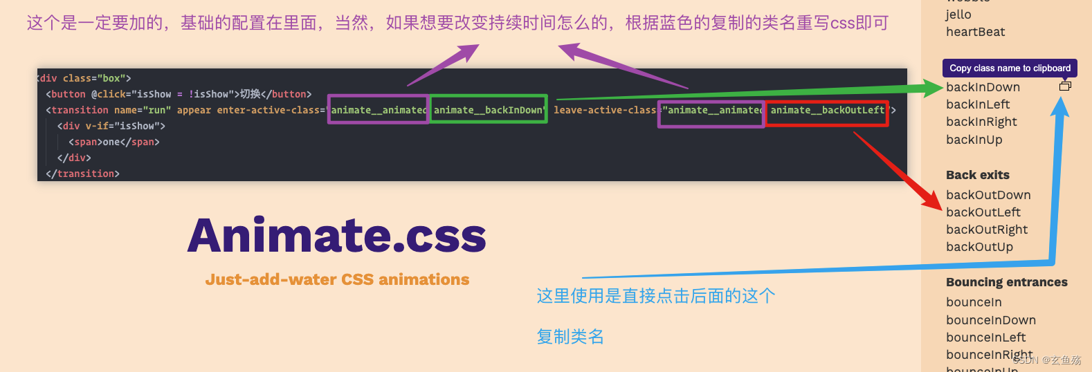
02-使用class类名
这里需使用enter-active-class 和 leave-active-class,css部分可以不写啦
代码
可以不用写name了,如果写了class类名,类名的优先级会更高
<template> <div class="box"> <button @click="isShow = !isShow">切换</button> <transition enter-active-class="animate__animated animate__backInDown" leave-active-class="animate__animated animate__backOutLeft"> <div v-if="isShow"> <span>one</span> </div> </transition> </div></template>效果
说明
三、使用gsap库 ( JS库 )
GreenSock - Docs - Gsap
某些情况下,如果希望通过JavaScript来实现动画效果,那么可以使用gsap库来完成
GSAP : The GreenSock Animation Platform ( GreenSock动画平台 ) 的缩写可以通过JavaScript为CSS属性、SVG、Canvas等设置动画,并且兼容浏览器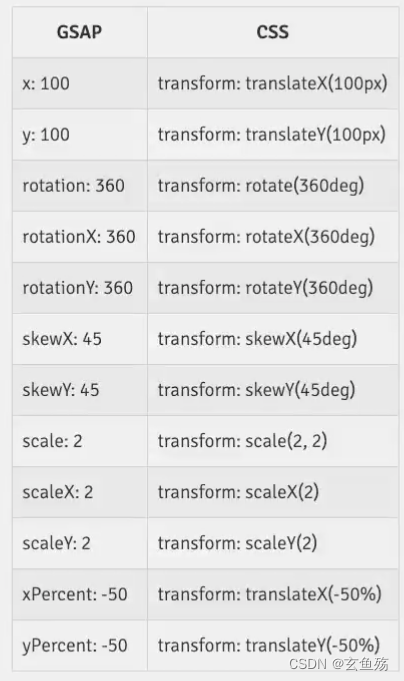
1.安装
npm install gsap 2.导入
在组件内部导入即可
import gsap from 'gsap'3.使用
需要使用enter和leave回调函数
<template> <div class="box"> <button @click="isShow = !isShow">切换</button> <transition appear @enter="enter" @leave="leave" :css="false"> <div v-if="isShow"> <span>one</span> </div> </transition> </div></template><script>// 导入import gsap from 'gsap'export default { data() { return { isShow: true } }, methods: { enter(el, done) { // 从哪里来 gsap.from(el, { // 缩小为0 scale: 0, // 透明度 opacity: 0, // 持续时间 duration: 1, // translatex便宜200 x: 200, // 这样设置比较好 onComplete: done }) }, /** * 这里只需要制定最开始的状态,不用制定后面的状态,有点不好理解 */ leave(el, done) { // 到哪里去 gsap.to(el, { scale: 0, opacity: 0, duration: 1, x: -200, onComplete: done }) } }}</script><style lang="scss" scoped></style>4.效果
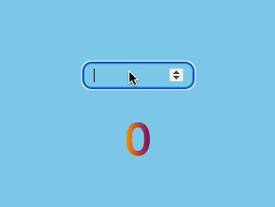
5.gsap额外补充 ( 数字变化效果 )
代码
<template> <div class="box"> <input type="number" step="100" v-model="count" /> <div> <span class="text-color">{{ showNumber.toFixed(0) }}</span> </div> </div></template><script>import gsap from 'gsap'export default { data() { return { count: 0, showNumber: 0 } }, watch: { // 监听输入值的改变 count(newValue) { // 把当前this存进去,实时更改showNumber的值 gsap.to(this, { duration: 0.5, showNumber: newValue }) } }}</script><style lang="scss" scoped>.box { padding: 200px; background-color: skyblue; box-shadow: 0 0 100px 0 skyblue; input { border: 3px solid rgb(7, 172, 237); border-radius: 10px; padding: 5px 10px; width: 100px; background-color: skyblue; } .text-color { display: inline-block; background-image: linear-gradient(to right, orange, purple); background-clip: text; color: transparent; font-size: 50px; }}</style>效果
四、列表的过渡 transition-group
在上面的文章中,过渡动画只是针对单个元素或者单个组件的,如果希望渲染的是一个列表,并且该列表中添加、删除数据也希望有动画执行
使用 transition-group :

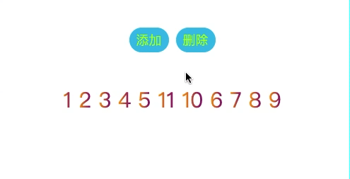
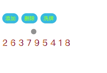
1.列表数字增加删除效果
01-代码
<template> <div class="box"> <div> <button @click="addNum">添加</button> <button @click="removeNum">删除</button> </div> <transition-group tag="p" name="run"> <span class="item" v-for="item in dataList" :key="item">{{ item }}</span> </transition-group> </div></template><script>export default { data() { return { dataList: [1, 2, 3, 4, 5, 6, 7, 8, 9], defaultNumber: 10 } }, methods: { // 随机位置增加一个数字 addNum() { this.dataList.splice(this.randomIndex(), 0, this.defaultNumber++) }, // 随机位置删除一个数字 removeNum() { this.dataList.splice(this.randomIndex(), 1) }, // 随机取一个位置 randomIndex() { return Math.floor(Math.random() * this.dataList.length) } }}</script><style lang="scss" scoped>.item { display: inline-block; margin-right: 10px; display: inline-block; background-image: linear-gradient(to right, orange, purple); background-clip: text; color: transparent; font-size: 30px;}.run-enter-from,.run-leave-to { opacity: 0; transform: translateY(50px);}.run-enter-active,.run-leave-active { transition: all 1s linear 0s;}</style>效果
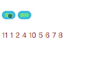
02.效果优化
优化点 : 新增和删除的节点是有动画,但是对于其他需要移动的节点是没有动画的
可以通过新增的v-move的class来完成动画,它会在元素改变位置的过程中应用
css代码
<style lang="scss" scoped>.item { display: inline-block; margin-right: 10px; display: inline-block; background-image: linear-gradient(to right, orange, purple); background-clip: text; color: transparent; font-size: 30px;}.run-enter-from,.run-leave-to { opacity: 0; transform: translateY(50px);}.run-enter-active,.run-leave-active { transition: all 1s linear 0s;}// 移除的时候需要加上.run-leave-active { position: absolute;}// 加上这个.run-move { transition: transform 1s linear 0s;}</style>效果
03.增加洗牌效果
one-安装lodash库
npm install lodashtwo-导入
import _ from 'lodash'three-使用
<template> <div class="box"> <div> <button @click="addNum">添加</button> <button @click="removeNum">删除</button> <button @click="shuffleNum">洗牌</button> </div> <transition-group tag="p" name="run"> <span class="item" v-for="item in dataList" :key="item">{{ item }}</span> </transition-group> </div></template><script>import _ from 'lodash'export default { data() { return { dataList: [1, 2, 3, 4, 5, 6, 7, 8, 9], defaultNumber: 10 } }, methods: { // 随机位置增加一个数字 addNum() { this.dataList.splice(this.randomIndex(), 0, this.defaultNumber++) }, // 随机位置删除一个数字 removeNum() { this.dataList.splice(this.randomIndex(), 1) }, // 洗牌 shuffleNum() { this.dataList = _.shuffle(this.dataList) }, // 随机取一个位置 randomIndex() { return Math.floor(Math.random() * this.dataList.length) } }}</script><style lang="scss" scoped>.item { display: inline-block; margin-right: 10px; display: inline-block; background-image: linear-gradient(to right, orange, purple); background-clip: text; color: transparent; font-size: 30px;}.run-enter-from,.run-leave-to { opacity: 0; transform: translateY(50px);}.run-enter-active,.run-leave-active { transition: all 1s linear 0s;}// 移除的时候需要加上.run-leave-active { position: absolute;}// 加上这个属性.run-move { transition: transform 1s linear 0s;}</style>fore-效果
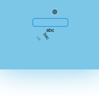
2.列表的交替动画效果
01-用css实现
代码
<template> <div class="box"> <input type="text" v-model="keyWords" /> <transition-group tag="ul" name="run" class="nav"> <li class="item" v-for="item in filterData" :key="item">{{ item }}</li> </transition-group> </div></template><script>export default { data() { return { keyWords: '', dataList: ['abc', 'bac', 'aec', 'qqw', 'qbf', 'aaa', 'afa'] } }, computed: { // 赛选一下 filterData() { return this.dataList.filter((item) => item.includes(this.keyWords)) } }}</script><style lang="scss" scoped>.run-enter-from,.run-leave-to { opacity: 0; transform: translateX(100px) rotate(180deg);}.run-enter-active,.run-leave-active { transition: all 1s linear 0s;}.box { padding: 100px 0; background-color: skyblue; box-shadow: 0 0 100px 0 skyblue; display: flex; flex-direction: column; justify-content: center; align-items: center; input { border: 3px solid rgb(7, 172, 237); border-radius: 10px; padding: 5px 10px; width: 100px; background-color: skyblue; } .text-color { display: inline-block; background-image: linear-gradient(to right, orange, purple); background-clip: text; color: transparent; font-size: 50px; }}.nav { width: 100%; display: flex; list-style: none; margin: 0; padding: 0; text-align: center; .item { flex: 1; }}</style>效果

ps : 那么是同时消失,同时出现,实现不了交替效果
02-使用js实现动画
通过delay属性,实现交替效果
代码
<template> <div class="box"> <input type="text" v-model="keyWords" /> <transition-group tag="ul" name="run" class="nav" @enter="enter" @leave="leave" appear> <!-- 使用data-*这样的属性,给每个动画元素加上index --> <li class="item" v-for="(item, index) in filterData" :data-index="index" :key="item"> {{ item }} </li> </transition-group> </div></template><script>import gsap from 'gsap'export default { data() { return { keyWords: '', dataList: ['abc', 'bac', 'aec', 'qqw', 'qbf', 'aaa', 'afa'], // 抽取一下动画参数 transitionOption: { opacity: 0, scale: 0.5, height: 0, rotate: 360 } } }, computed: { // 赛选一下 filterData() { return this.dataList.filter((item) => item.includes(this.keyWords)) } }, methods: { enter(el, done) { gsap.from(el, { ...this.transitionOption, // 设置延迟时间,因为是交替,所以每个都要不一样 delay: el.dataset.index * 0.2, xPercent: -20, onComplete: done }) }, leave(el, done) { gsap.to(el, { ...this.transitionOption, // 设置延迟时间,因为是交替,所以每个都要不一样 delay: el.dataset.index * 0.2, xPercent: 20, onComplete: done }) } }}</script><style lang="scss" scoped>.box { padding: 100px 0; background-color: skyblue; box-shadow: 0 0 100px 0 skyblue; display: flex; flex-direction: column; justify-content: center; align-items: center; input { border: 3px solid rgb(7, 172, 237); border-radius: 10px; padding: 5px 10px; width: 100px; background-color: skyblue; } .text-color { display: inline-block; background-image: linear-gradient(to right, orange, purple); background-clip: text; color: transparent; font-size: 50px; }}.nav { width: 100%; // display: flex; list-style: none; margin: 0; padding: 0; text-align: center; position: relative; .item { flex: 1; }}</style>效果
五、写在最后
? ? 谢谢聪明美丽帅气的你看到我的文章,支持一下可否
? ? 您的点赞,就是我动力的源泉,让我跨过彼岸
⭐️ ⭐️ 您的收藏,就是我期待的远方,让我目标坚定
✏️ ✏️ 您的评论,就是我心灵的医生,让我完善己身