✨✨ 欢迎大家来到景天科技苑✨✨
?? 养成好习惯,先赞后看哦~??
所属的专栏:前端泛海
景天的主页:景天科技苑
文章目录
Bootstrap1.Bootstrap介绍2.简单使用3.布局容器4.Bootstrap实现轮播图
Bootstrap
Bootstrap官网
1.Bootstrap介绍
一、什么是Bootstrap?
bootstrap是一个基于HTML、CSS和Javascript语言编写的框架,具有简单、灵活的特性,拥有样式库、组件和插件,bootstrap常用来开发响应式布局和移动设备优先的Web项目,能够帮助开发者快速搭建前端页面。
Bootstrap诞生于2011年,来自Twitter公司,是目前最受欢迎的前端框架
是一个用于快速开发Web应用程序和网站的前端框架
Bootstrap是基于HTML、CSS、JS的,简洁灵活,使得Web开发更加快捷
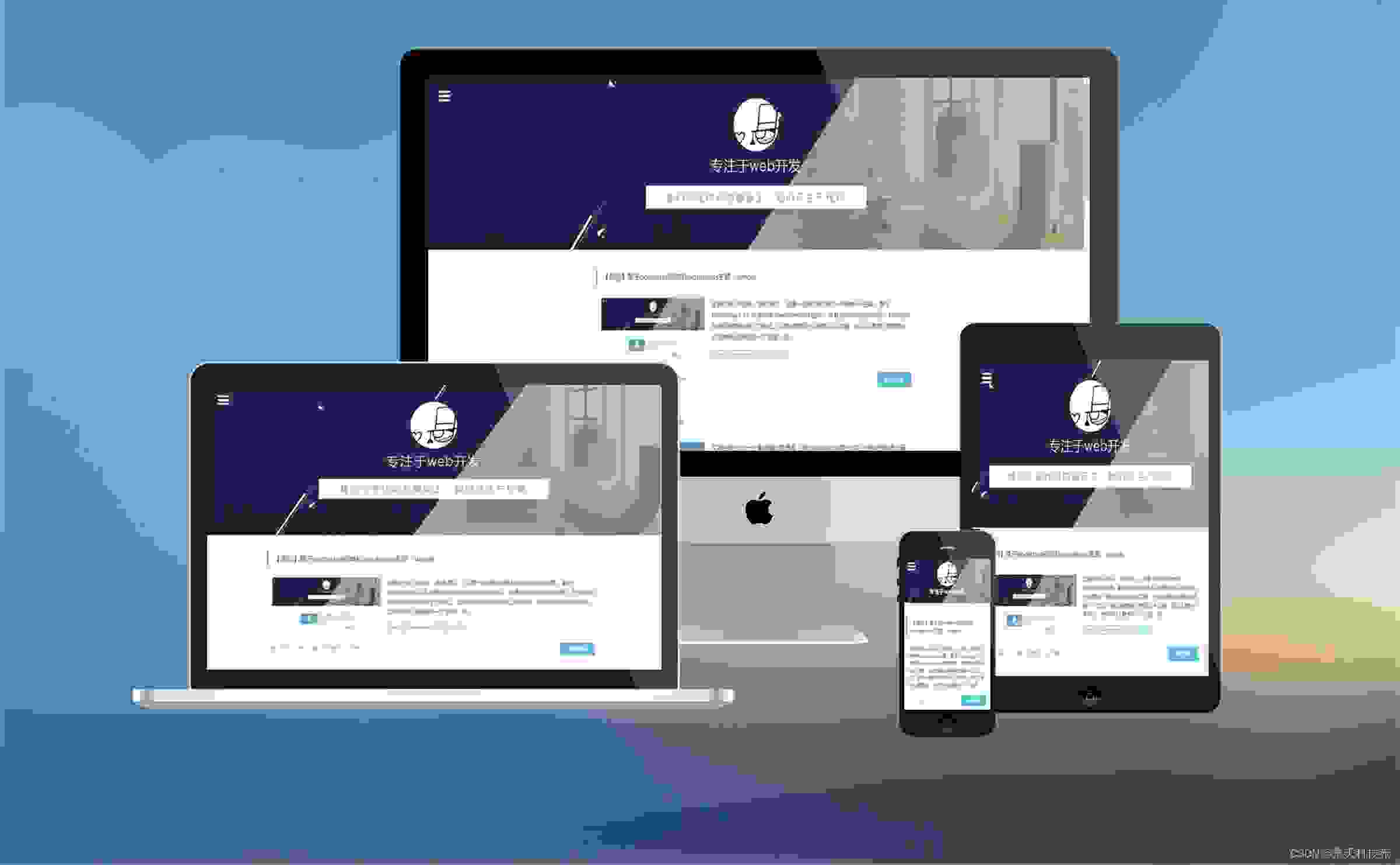
概述:Bootstrap是一个建立一个页面,就可以在三个终端(PC端、平板、手机)上完美展示的响应式前端框架
二、为什么要用Bootstrap
因为Bootstrap是一个简洁、直观、强悍的前端开发框架,让web开发更迅速、更容易上手。
封装了常用的css样式,js动态效果。直接调用
使用bootstrap的宗旨就是 ctrl c / ctrl v
三、如何使用Bootstrap
1.下载Bootstrap库 https://v4.bootcss.com/(Bootstrap管网)
2.页面中引入库
jquery-3.3.1.js:jQuery库【注意:必须在Bootstrap核心库引入之前引入jQuery库】
bootstrap.css:Bootstrap核心样式【添加到head标签中】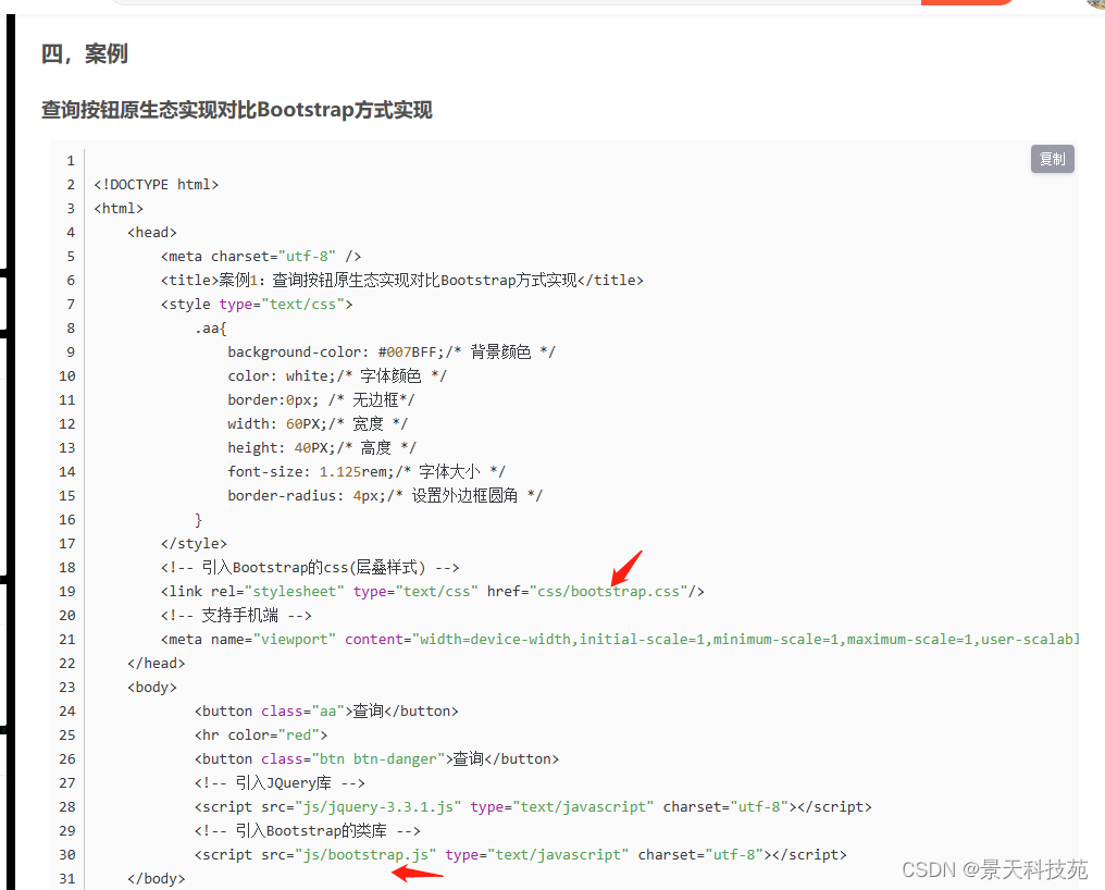
使用最新版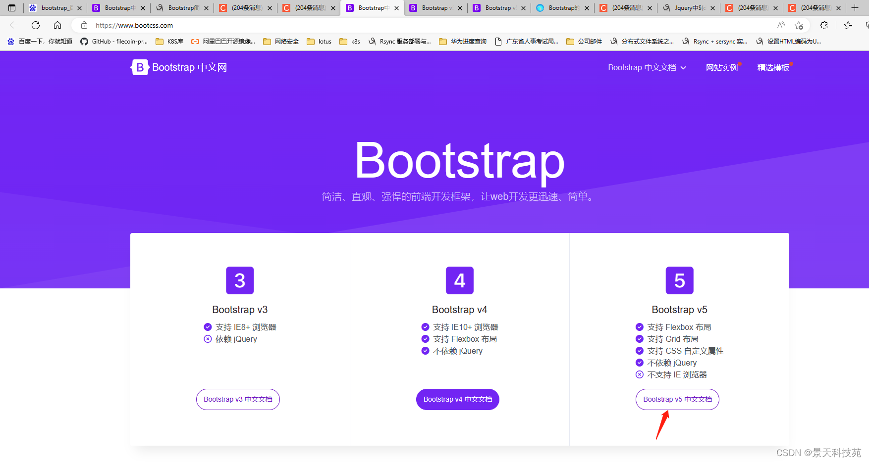
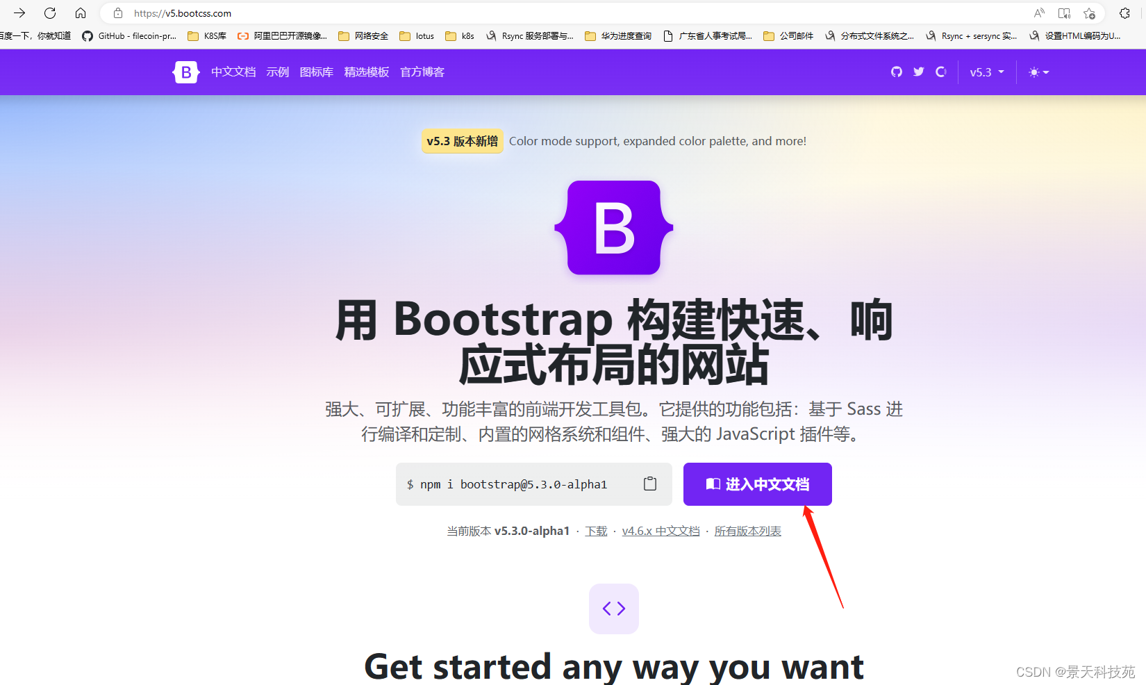
下载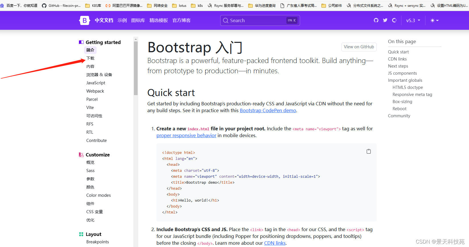
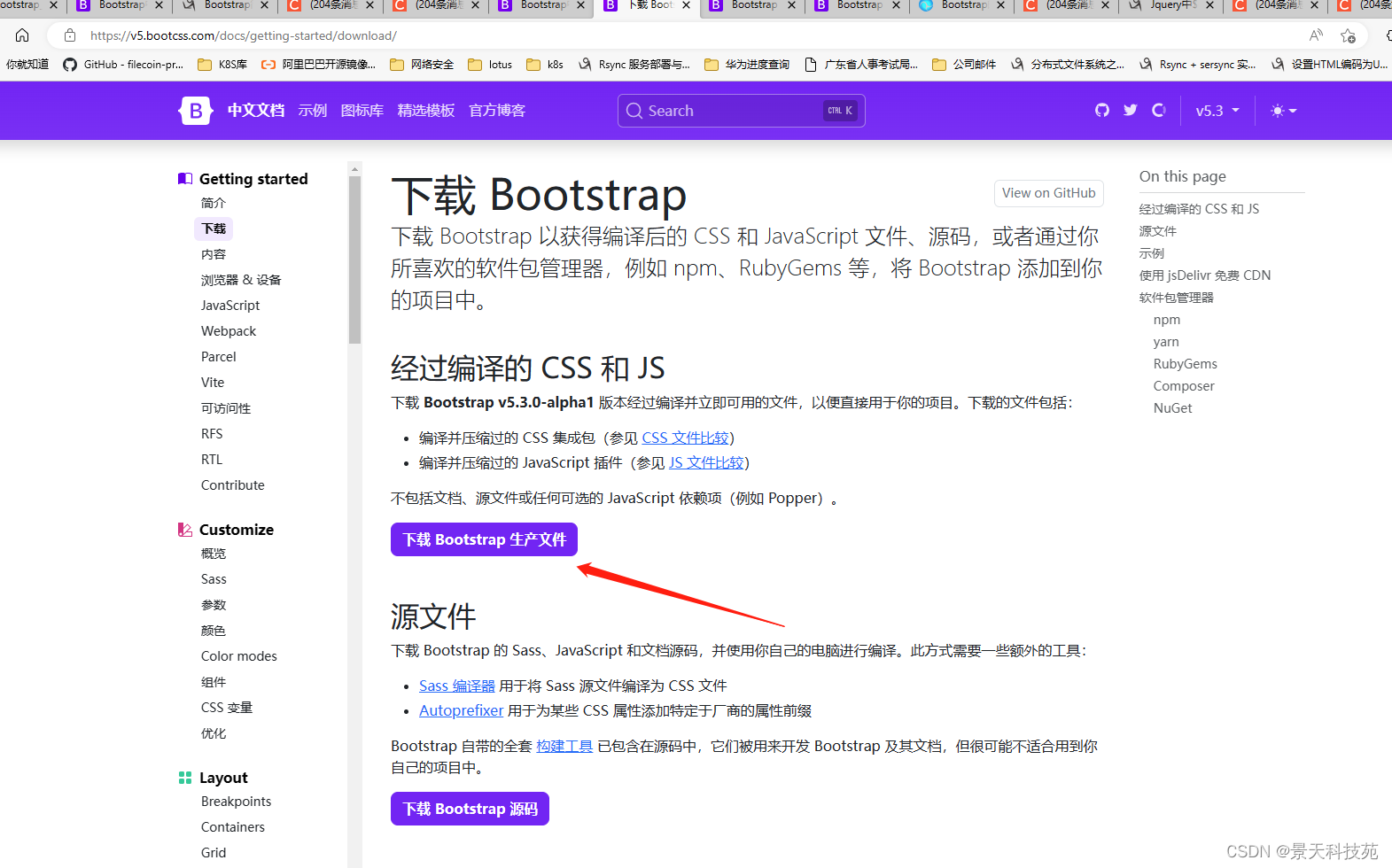
并且提供CDN加速在线引入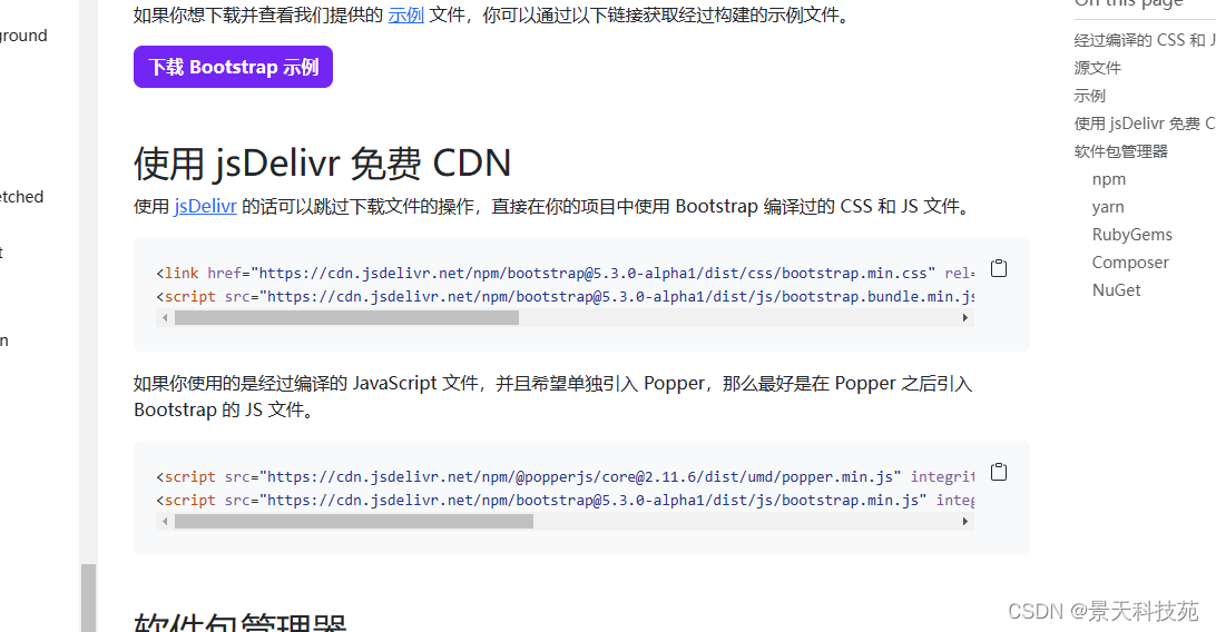
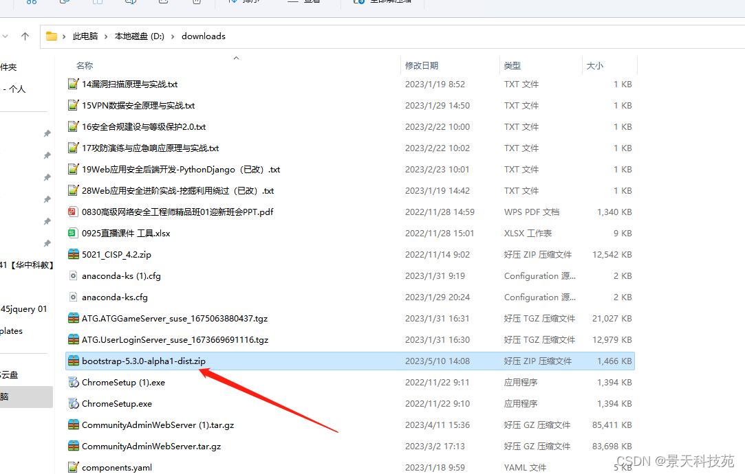
解压后包含两个文件夹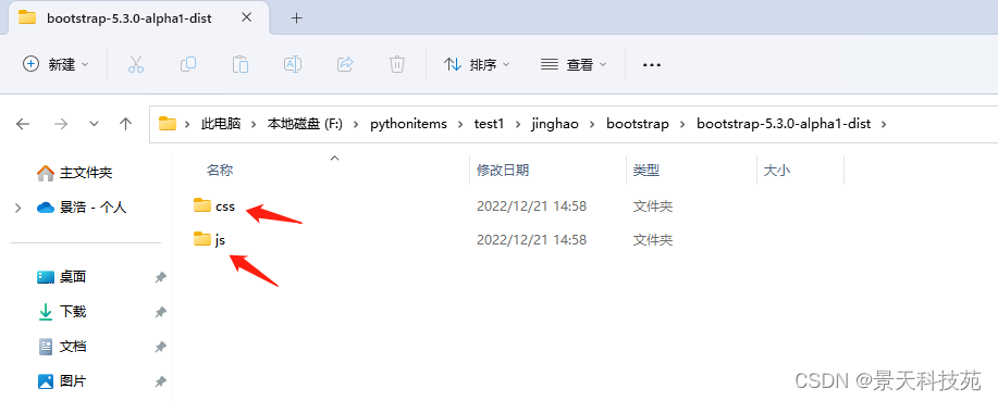
不管是css,还是js,带min的都是压缩过的。生产中使用压缩过的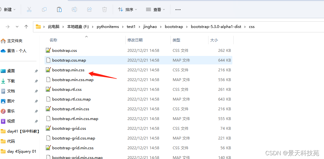
解压后,在项目中引入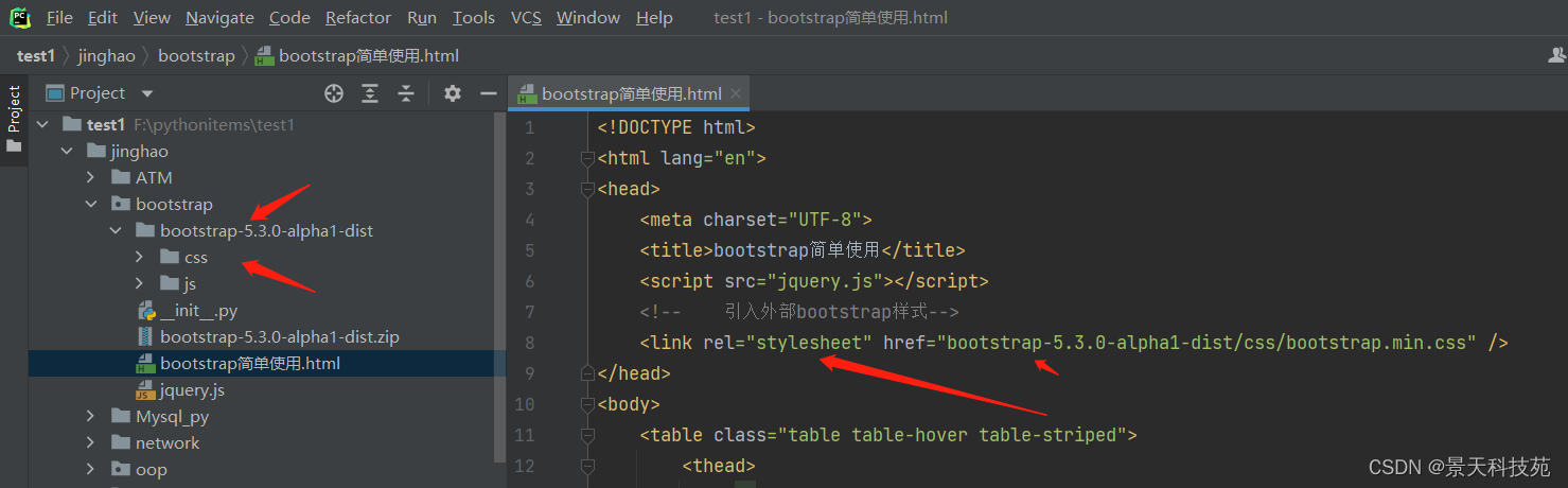
2.简单使用
<!DOCTYPE html><html lang="en"><head> <meta charset="UTF-8"> 适配IE浏览器的edge浏览器 <meta http-equiv="X-UA-Compatible" content="IE=edge"> 适配手机端,自适应手机屏幕大小,调整分辨率,方便手机观看 <meta name="viewport" content="width=device-width, initial-scale=1.0"> <title>bootstrap简单使用</title> <script src="jquery.js"></script> <!-- 引入外部bootstrap样式--> <link rel="stylesheet" href="bootstrap-5.3.0-alpha1-dist/css/bootstrap.min.css" /></head>没做手机屏幕适配之前,很小看不清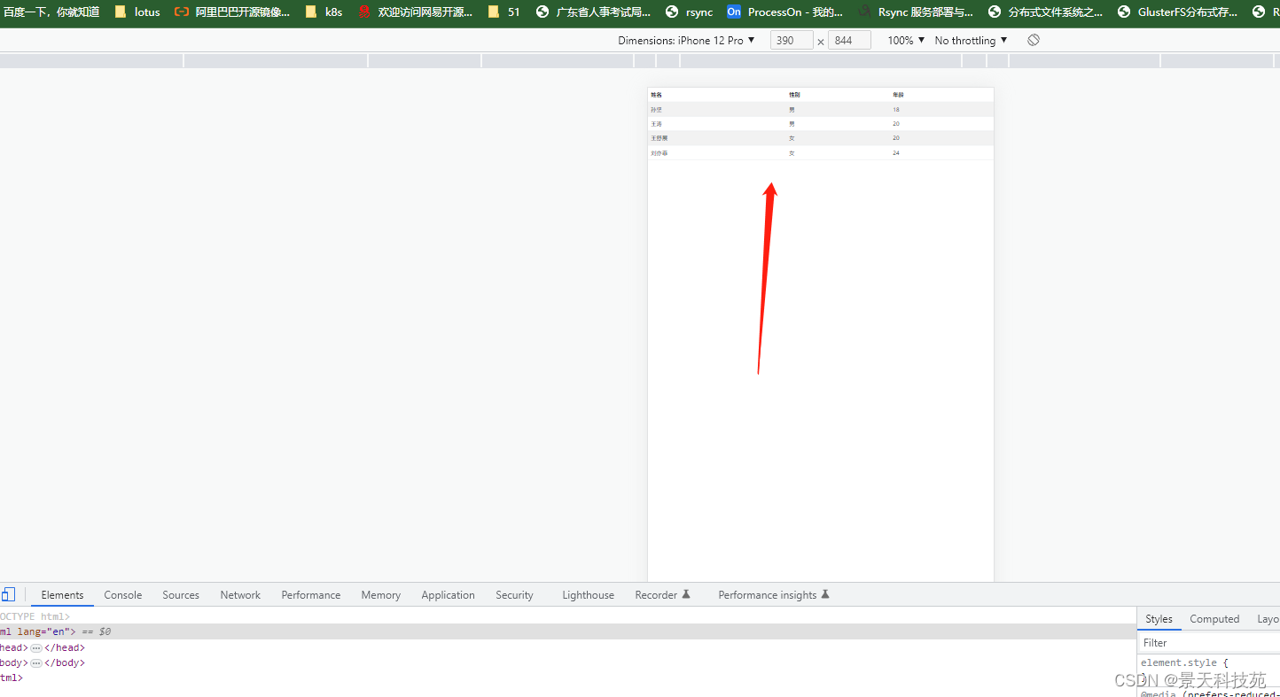
做了手机屏幕适配后,等比例缩放,但是这样缩放可能会导致页面显示不完内容。因此这就需要做响应式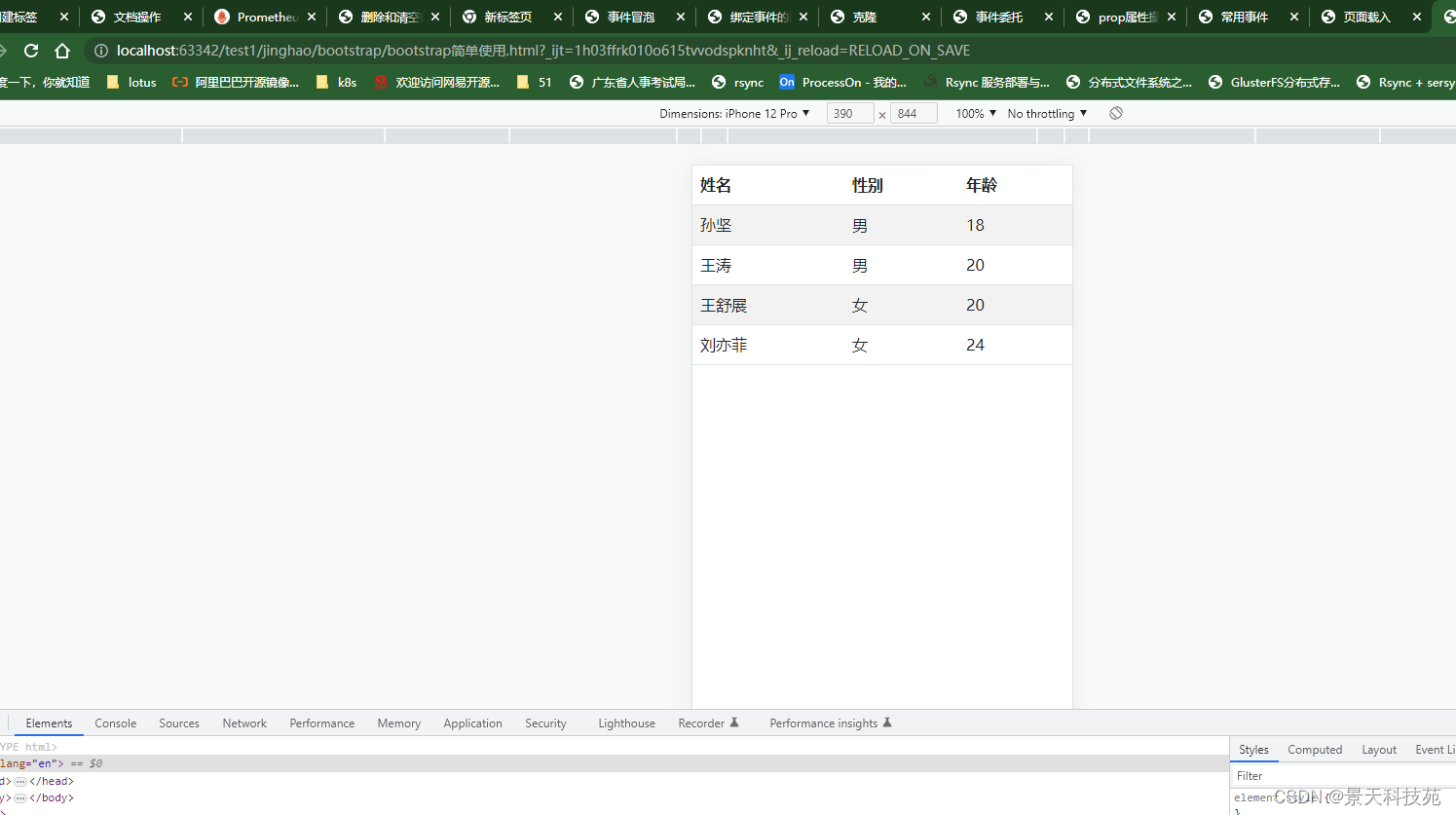
我们不用设置任何样式,只需引入bootstrap自带的css样式即可
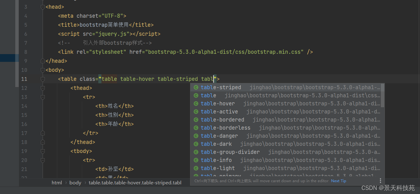
<body> <table class="table table-hover table-striped"> <thead> <tr> <th>姓名</th> <th>性别</th> <th>年龄</th> </tr> </thead> <tbody> <tr> <td>孙坚</td> <td>男</td> <td>18</td> </tr> <tr> <td>王涛</td> <td>男</td> <td>20</td> </tr> <tr> <td>王舒展</td> <td>女</td> <td>20</td> </tr> <tr> <td>刘亦菲</td> <td>女</td> <td>24</td> </tr> </tbody> </table></body>浏览器显示效果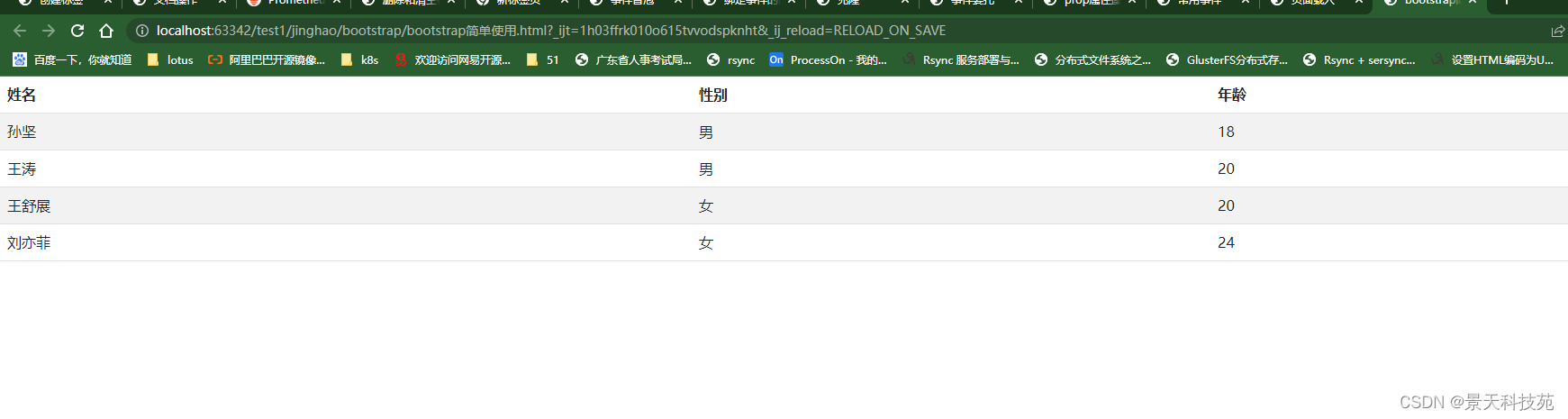
</html>3.布局容器
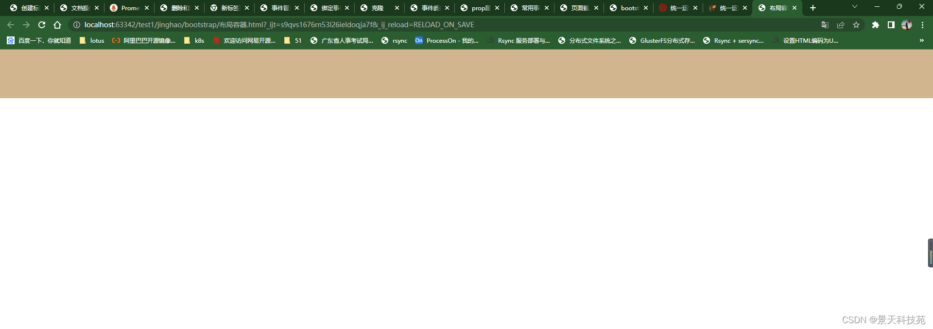
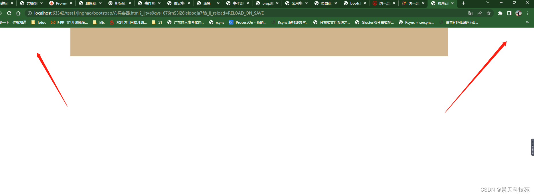
<!DOCTYPE html><html lang="en"><head> <meta charset="UTF-8"> <title>Title</title> <link rel="stylesheet" href="bootstrap-3.3.7-dist/css/bootstrap.min.css"> <meta name="viewport" content="width=device-width, initial-scale=1"> <style> .c1{ background-color:tan; height:100px; } .c2{ background-color:pink; height:100px; } .c3{ background-color:green; height:100px; } </style></head><body><!-- container-fluid占满整个屏幕 -->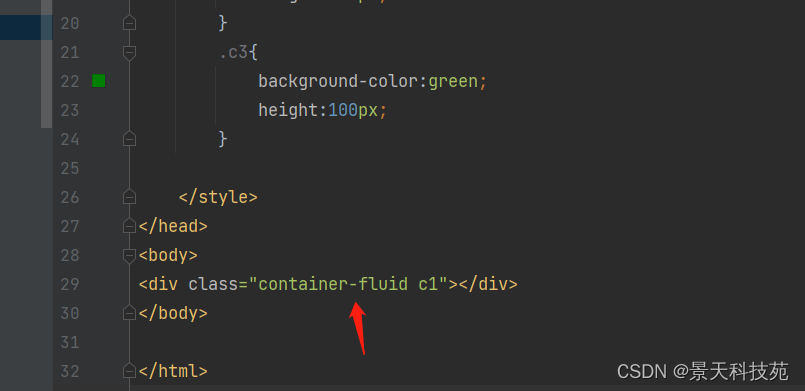
<!-- container 左右两边有留白 -->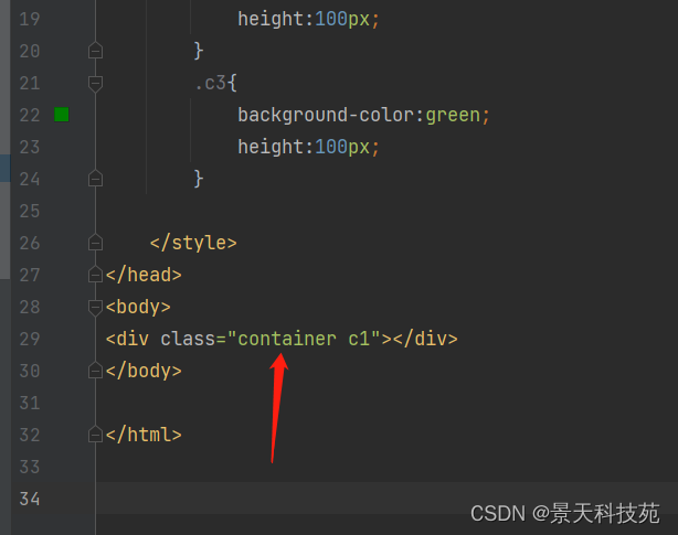
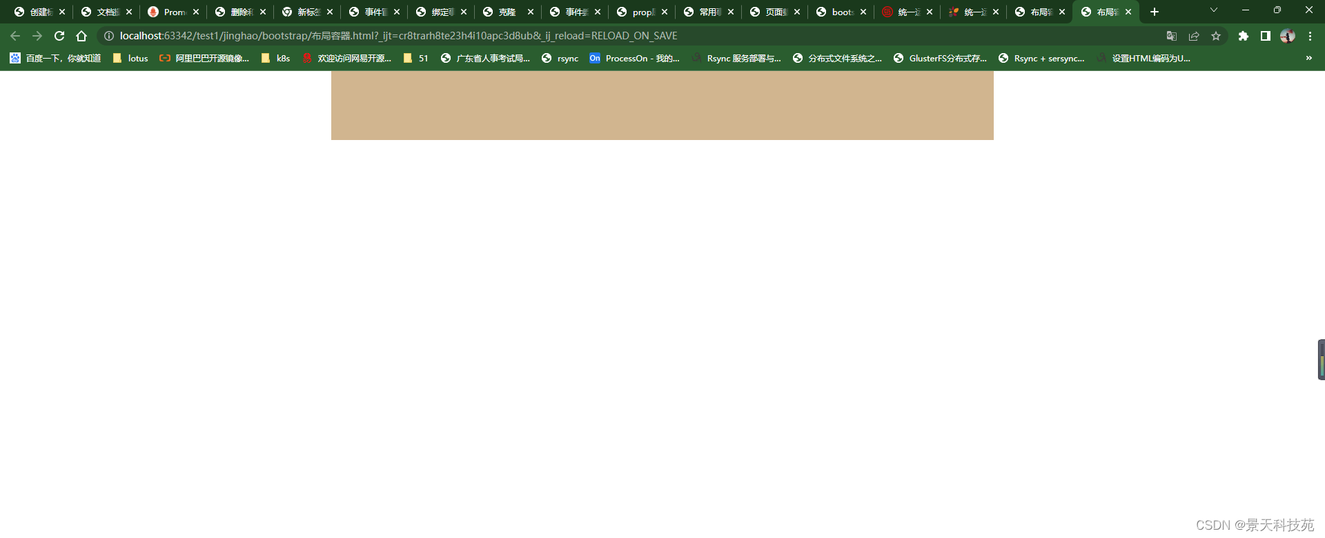
<div class="container-fluid"> <div class="row"><!-- // col-md-offset-3 栅格偏移,向右偏移3个栅格的意思--><!-- // col-md-6 占6个栅格,默认从左边开始--> <div class="col-md-6 c1 col-md-offset-3"> <div class="row"> <div class="col-md-6 c3"></div> </div> </div><!-- <div class="col-md-8 c2"></div>--> </div></div><!--<div class="container c1"></div>-->栅格单位,铺满是12个栅格,各占6个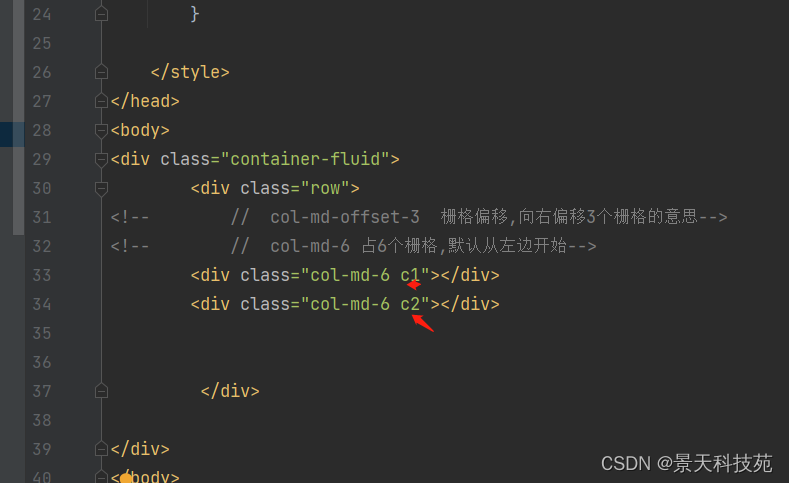
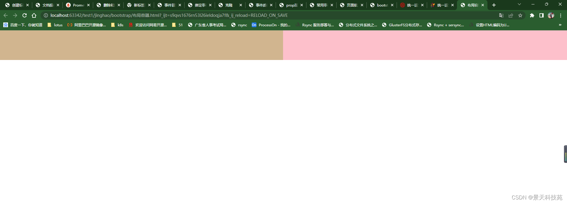
如果是占不满,留空白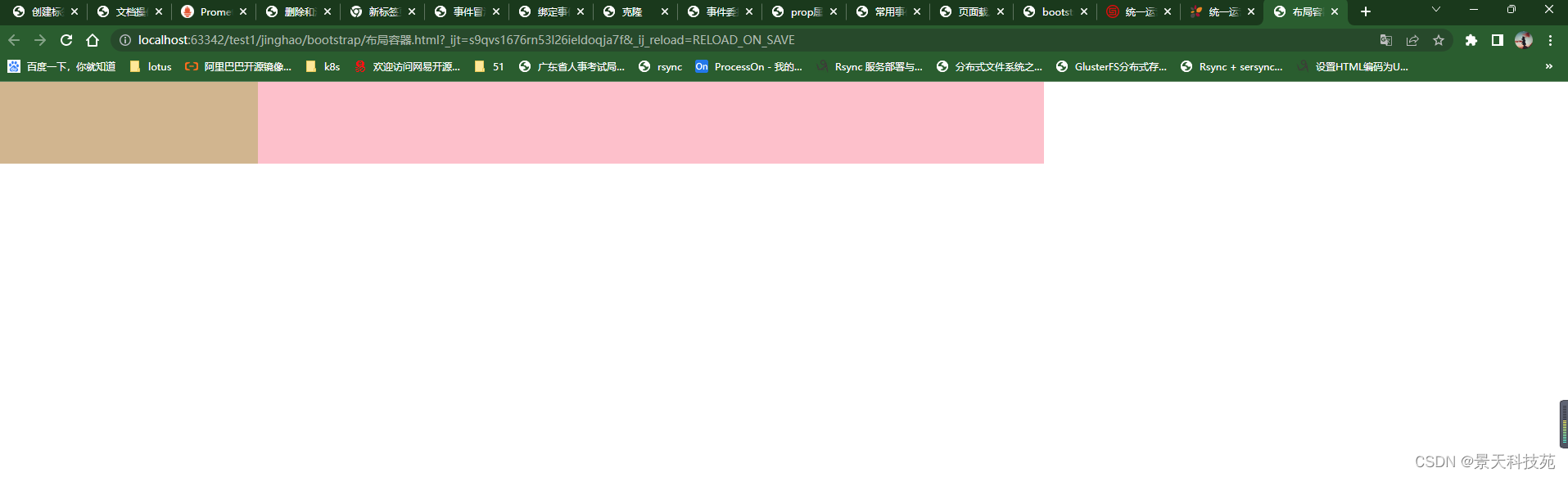
如果两个加起来超过12个,则第二个换行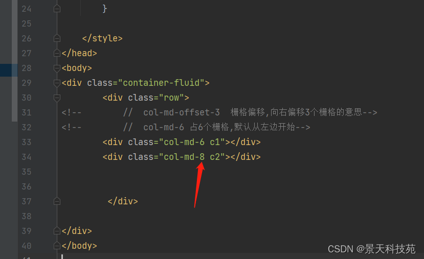
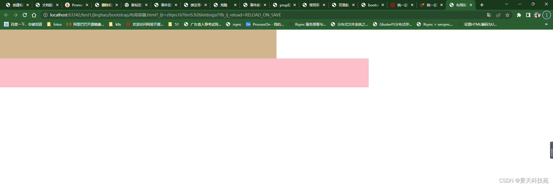
新版的栅格偏移,默认从左边开始,设置了栅格偏移可以从指定栅格开始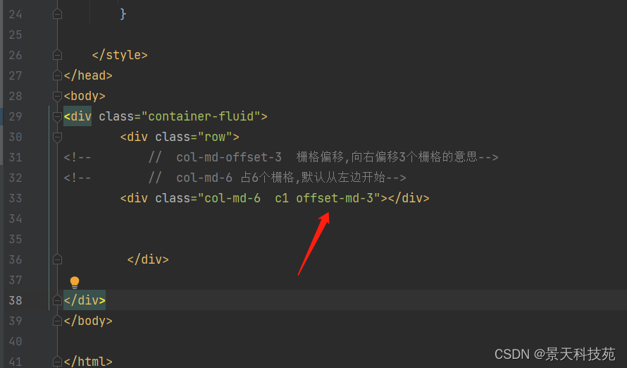
具体使用方法,可以参照官网使用说明,很详细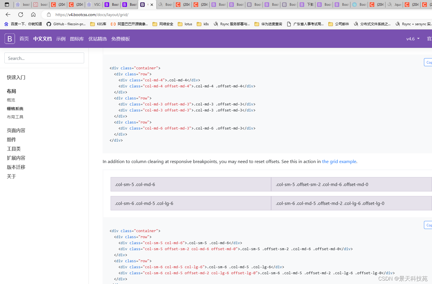
缩小屏幕等分,不会换行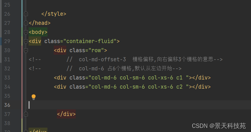
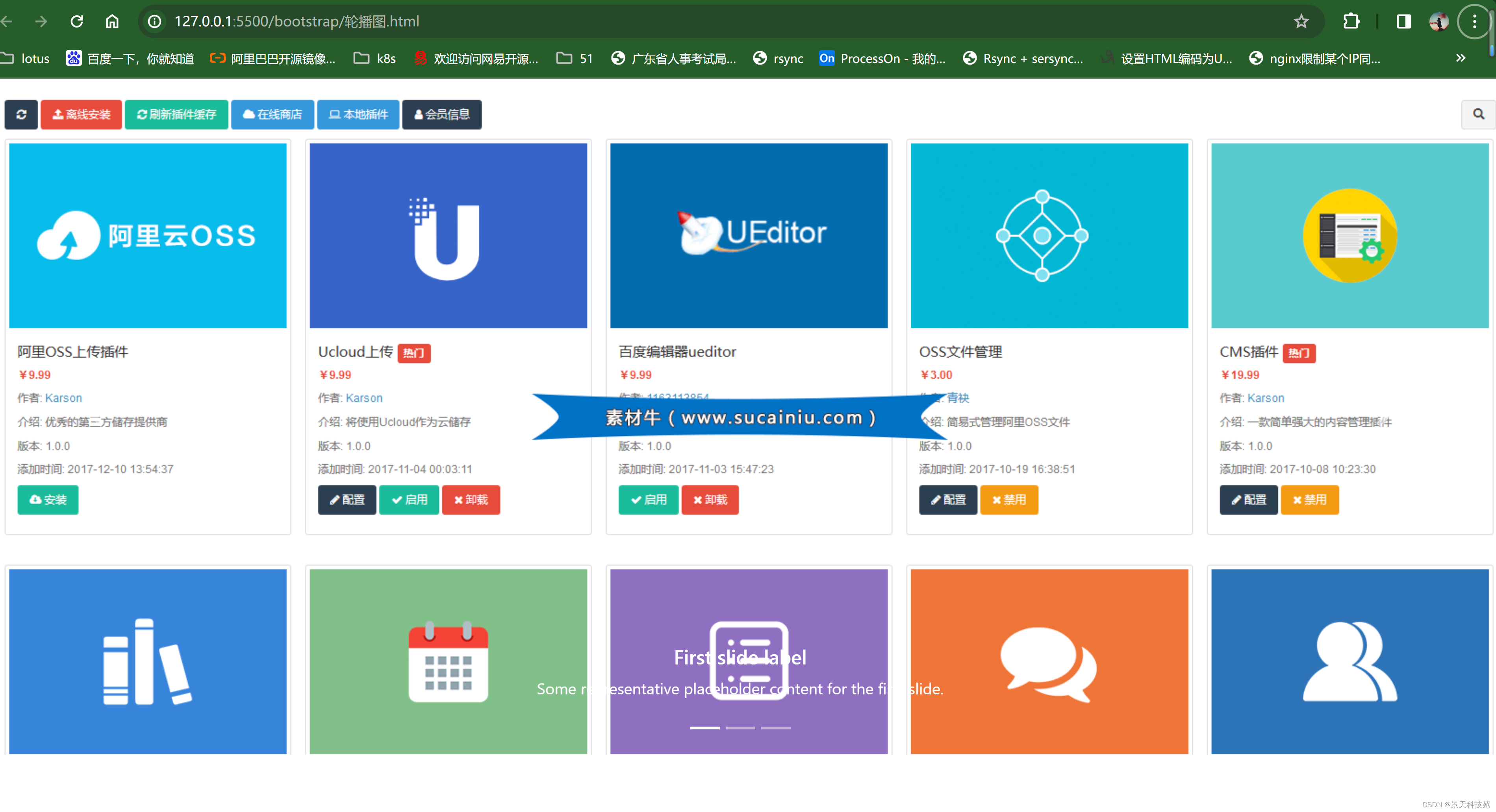
</body><script src="jquery.js"></script></html>4.Bootstrap实现轮播图
轮播图必须引入在bootstrap.js之前引入jQuery.js
设置轮播图轮换图片间隔时间,默认是5秒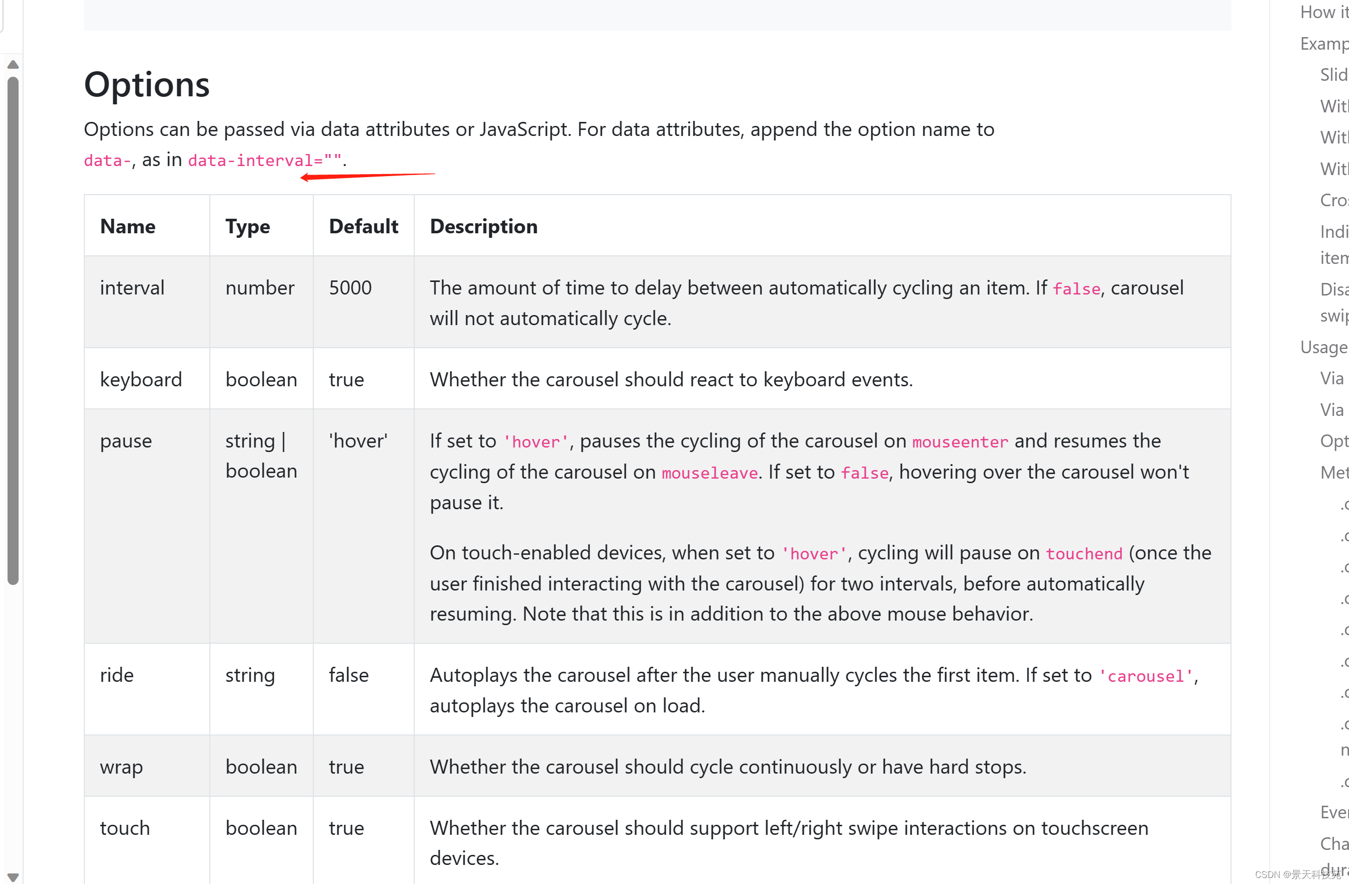
还可以通过js方法控制轮播时间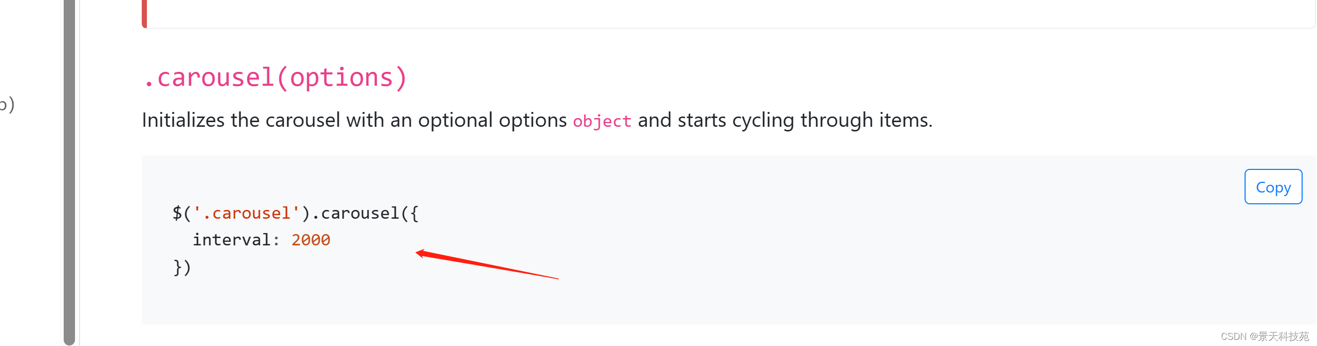
轮播图完整代码:
<!DOCTYPE html><html lang="en"> <head> <meta charset="UTF-8" /> <meta http-equiv="X-UA-Compatible" content="IE=edge" /> <meta name="viewport" content="width=device-width, initial-scale=1.0" /> <title>轮播图</title> <script src="jquery.js"></script> <link rel="stylesheet" href="bootstrap-4.6.2-dist/css/bootstrap.min.css" /> <script src="bootstrap-4.6.2-dist/js/bootstrap.min.js"></script> </head> <body> <div id="carouselExampleCaptions" class="carousel slide" data-ride="carousel" > <ol class="carousel-indicators"> <li data-target="#carouselExampleCaptions" data-slide-to="0" class="active" ></li> <li data-target="#carouselExampleCaptions" data-slide-to="1"></li> <li data-target="#carouselExampleCaptions" data-slide-to="2"></li> </ol> <div class="carousel-inner"> <div class="carousel-item active"> <img src="1.jpg" class="d-block w-100" alt="..." /> <div class="carousel-caption d-none d-md-block"> <h5>First slide label</h5> <p>Some representative placeholder content for the first slide.</p> </div> </div> <div class="carousel-item"> <img src="2.jpg" class="d-block w-100" alt="..." /> <div class="carousel-caption d-none d-md-block"> <h5>Second slide label</h5> <p>Some representative placeholder content for the second slide.</p> </div> </div> <div class="carousel-item"> <img src="3.jpg" class="d-block w-100" alt="..." /> <div class="carousel-caption d-none d-md-block"> <h5>Third slide label</h5> <p>Some representative placeholder content for the third slide.</p> </div> </div> </div> <button class="carousel-control-prev" type="button" data-target="#carouselExampleCaptions" data-slide="prev" > <span class="carousel-control-prev-icon" aria-hidden="true"></span> <span class="sr-only">Previous</span> </button> <button class="carousel-control-next" type="button" data-target="#carouselExampleCaptions" data-slide="next" > <span class="carousel-control-next-icon" aria-hidden="true"></span> <span class="sr-only">Next</span> </button> </div> </body> <script> $(".carousel").carousel({ interval: 2000, }); </script></html>效果,图片轮换播放: