文章目录
前言一、HTML(index.html)1. 加入元素 二、CSS(style.css)2. 重置浏览器样式3.设置字体样式4.将我们的元素居中5.设置背景颜色6.设置动画显示的位置7.设置夜晚时的背景色8.将动画显示的区域设置为圆型9.绘制白天时天空的样子10.绘制夜晚时天空的样子11.创建昼夜交替动画12.绘制太阳13.绘制海洋13.1 海洋底层颜色13.2 绘制夜晚时的海洋13.3丰富海洋层次感并设置浮动动画 14. 绘制小船14.1 绘制船身14.2 绘制船帆14.3 设置小船动画 15. 绘制月亮16. 绘制飞鸟16.1 设置三只鸟儿的位置及样式16.2 设置鸟儿飞行的动画 17. 绘制山峰18. 绘制云朵18.1 设置云朵图层的位置,定位云朵位置18.2 绘制云朵18.2.118.2.218.2.3 18.3 添加云朵的浮动动画 19. 绘制星星20. 绘制流星及动画21.设置字体的位置及样式完整CSS代码 三、JS(index.js)22. 设置元素间属性转换 总结
前言
今天分享一个唯美的日月交替的小动画,祝大家早安晚安,每日安好鸭!
仅需22步,带领大家,使用css+js绘制超好看的动画!大家可以跟着步骤一步一步编写,也可以直接复制完整代码至编译器,看效果!
ps:现在先贴代码啦,明天醒了更新具体的步骤,带领大家一步一步制作,感谢支持!
2022.5.13
今天更新具体步骤啦!
仅需22步,带领大家,使用css+js绘制超好看的动画!大家可以跟着步骤一步一步编写,也可以直接复制完整代码至编译器,看效果!
一、HTML(index.html)
1. 加入元素
分别加入我们需要的元素,天空,云彩,飞鸟,山川,太阳等,具体看代码中的注释
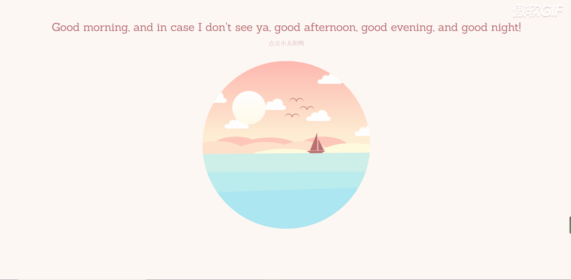
<!DOCTYPE html><html lang="en" ><head> <meta charset="UTF-8"> <title>早安、晚安动画</title> <link rel="stylesheet" href="https://cdnjs.cloudflare.com/ajax/libs/meyer-reset/2.0/reset.min.css"> <link rel="stylesheet" href="./style.css"></head><body><div class="container-wrapper"> <h1>Good morning, and in case I don't see ya, good afternoon, good evening, and good night!</h1> <p id="subtitle">点点小太阳鸭</p> <div class="container"> <div class="circle-container"> <!-- 天空部分 --> <div class="sky"> <div class="sky-night"> <div class="stars"> <div class="shooting-star"></div> <div class="star-group-1"></div> <div class="star-group-2"></div> <div class="star-group-3"></div> <div class="star-group-4"></div> </div> </div> <!-- 云彩 --> <div class="cloud cloud-1"></div> <div class="cloud cloud-2"></div> <div class="cloud cloud-3"></div> <div class="cloud cloud-4"></div> <div class="cloud cloud-5"></div> <div class="cloud cloud-6"></div> <div class="bird bird-1"></div> <div class="bird bird-2"></div> <div class="bird bird-3"></div> </div> <!-- 山川 --> <div class="mountains"> <div class="mountain-back"> <div class="mountain-back-1"></div> <div class="mountain-back-2"></div> </div> <div class="mountain-middle"> <div class="mountain-middle-1"></div> <div class="mountain-middle-2"></div> </div> <div class="mountain-top"> <div class="mountain-top-1"></div> </div> </div> <!-- 太阳 --> <div class="sun-container"> <div class="sun"></div> </div> <!-- 海洋 --> <div class="ocean"> <div class="boat"></div> <div class="ocean-night"> <div class="moon"></div> <!-- 山川 --> <div class="mountains mountains-bottom"> <div class="mountain-back"> <div class="mountain-back-1"></div> <div class="mountain-back-2"></div> </div> <div class="mountain-middle"> <div class="mountain-middle-1"></div> <div class="mountain-middle-2"></div> </div> <div class="mountain-top"> <div class="mountain-top-1"></div> </div> </div> </div> </div> </div> </div></div><!-- partial --><script src='https://cdnjs.cloudflare.com/ajax/libs/jquery/3.4.1/jquery.min.js'></script><script src="https://cdnjs.cloudflare.com/ajax/libs/prefixfree/1.0.7/prefixfree.min.js"></script><script src="./index.js"></script></body></html>运行效果:
二、CSS(style.css)
2. 重置浏览器样式
导入reset.min.css(已完成),重置浏览器标签的样式表,重新定义标签样式,覆盖浏览器的CSS默认属性,把浏览器提供的默认样式覆盖掉
@import url("https://fonts.googleapis.com/css?family=Sanchez");* { padding: 0; margin: 0; -webkit-box-sizing: border-box; box-sizing: border-box;}*:before,*:after { content: ""; position: absolute;}运行效果:
3.设置字体样式
html { font-family: "Sanchez", serif;}运行效果:
4.将我们的元素居中
.container-wrapper { width: 100%; height: 100%; display: -webkit-box; display: -ms-flexbox; display: flex; -webkit-box-pack: center; -ms-flex-pack: center; justify-content: center; -webkit-box-align: center; -ms-flex-align: center; align-items: center; -webkit-box-orient: vertical; -webkit-box-direction: normal; -ms-flex-direction: column; flex-direction: column;}运行效果:
5.设置背景颜色
html { -webkit-transition: background-color 3s ease; -o-transition: background-color 3s ease; transition: background-color 3s ease; -webkit-transition-delay: 2s; -o-transition-delay: 2s; transition-delay: 2s; background-color: #fff7f4;}运行效果: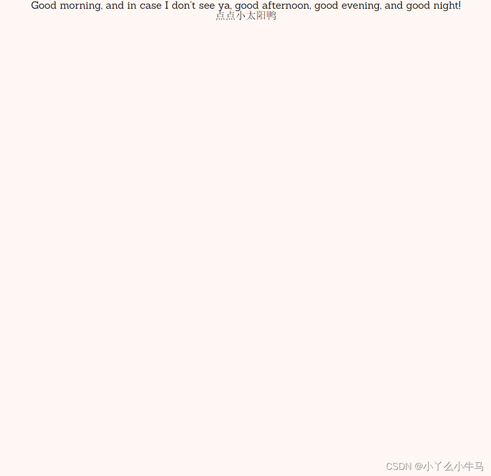
6.设置动画显示的位置
子绝父相,这是父元素,设置为相对定位
.container { width: 450px; height: 450px; position: relative;}7.设置夜晚时的背景色
我们将会在js中使用它
.container-night { background-color: #e4ecff;}8.将动画显示的区域设置为圆型
根据最终效果,我们将动画显示的区域设置为原型
.circle-container { width: 450px; height: 450px; -webkit-clip-path: circle(50% at 50% 50%); clip-path: circle(50% at 50% 50%); position: absolute; overflow: hidden; z-index: 100;}9.绘制白天时天空的样子
.sky { position: absolute; width: 100%; height: 55%; top: 0; background: -webkit-gradient( linear, left top, left bottom, from(#feb8b0), to(#fef9db) ); background: -webkit-linear-gradient(#feb8b0, #fef9db); background: -o-linear-gradient(#feb8b0, #fef9db); background: linear-gradient(#feb8b0, #fef9db); z-index: 1; overflow: hidden;}运行效果: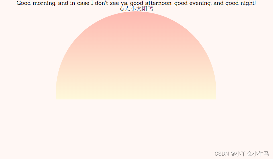
10.绘制夜晚时天空的样子
绘制夜晚时天空的样子,我们使用opacity属性,将其设置为不可见,在js中使用toggleClass方法将该属性切换为1,使其可见,后头很多动画都是这么实现的。运行效果的图中将该属性设置为了1,方便大家先看到效果
.sky-night { position: absolute; width: 100%; height: 100%; background: -webkit-gradient( linear, left top, left bottom, from(#4c3f6d), color-stop(#6c62bb), to(#93b1ed) ); background: -webkit-linear-gradient(#4c3f6d, #6c62bb, #93b1ed); background: -o-linear-gradient(#4c3f6d, #6c62bb, #93b1ed); background: linear-gradient(#4c3f6d, #6c62bb, #93b1ed); opacity: 0; -webkit-transition: opacity 3s; -o-transition: opacity 3s; transition: opacity 3s; -webkit-transition-delay: 2s; -o-transition-delay: 2s; transition-delay: 2s;}/*用于切换opacity属性*/.sky-night-fade { opacity: 1;}运行效果: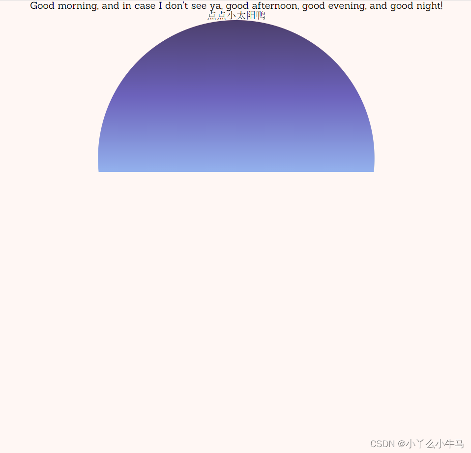
11.创建昼夜交替动画
@-webkit-keyframes sky-night { 0% { background: -webkit-gradient( linear, left top, left bottom, from(#feb8b0), to(#fef9db) ); background: -webkit-linear-gradient(#feb8b0, #fef9db); background: linear-gradient(#feb8b0, #fef9db); } 100% { background: -webkit-gradient( linear, left top, left bottom, from(#4c3f6d), to(#96b5ee) ); background: -webkit-linear-gradient(#4c3f6d, #96b5ee); background: linear-gradient(#4c3f6d, #96b5ee); }}@keyframes sky-night { 0% { background: -webkit-gradient( linear, left top, left bottom, from(#feb8b0), to(#fef9db) ); background: -webkit-linear-gradient(#feb8b0, #fef9db); background: -o-linear-gradient(#feb8b0, #fef9db); background: linear-gradient(#feb8b0, #fef9db); } 100% { background: -webkit-gradient( linear, left top, left bottom, from(#4c3f6d), to(#96b5ee) ); background: -webkit-linear-gradient(#4c3f6d, #96b5ee); background: -o-linear-gradient(#4c3f6d, #96b5ee); background: linear-gradient(#4c3f6d, #96b5ee); }}12.绘制太阳
设置太阳的位置,并绘制太阳
.sun-container { z-index: 10; position: absolute; left: 0; right: 0; margin: auto; top: 0; bottom: 0; width: 290px; height: 290px; /* background-color: rgba(255, 0, 255, 0.2);*/ -webkit-transform-origin: center center; -ms-transform-origin: center center; transform-origin: center center; -webkit-transition: all 5s ease-in-out; -o-transition: all 5s ease-in-out; transition: all 5s ease-in-out;}.sun { position: absolute; width: 90px; height: 90px; border-radius: 50%; background: -webkit-gradient( linear, left top, left bottom, from(#fefefe), to(#fffbe8) ); background: -webkit-linear-gradient(#fefefe, #fffbe8); background: -o-linear-gradient(#fefefe, #fffbe8); background: linear-gradient(#fefefe, #fffbe8); cursor: pointer; z-index: 10;}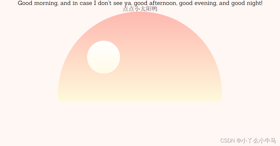
13.绘制海洋
13.1 海洋底层颜色
绘制海洋部分,及其动画效果,同样使用toggleClass设置动画停止后,海洋的样式
.ocean { position: absolute; width: 100%; height: 45%; bottom: 0; background: #ceefe8; z-index: 200; -webkit-animation: ocean-top 3s infinite; animation: ocean-top 3s infinite; opacity: 1; -webkit-transition: all 3s ease; -o-transition: all 3s ease; transition: all 3s ease; -webkit-transition-delay: 2s; -o-transition-delay: 2s; transition-delay: 2s; -webkit-transform-origin: top; -ms-transform-origin: top; transform-origin: top;}.animation-stop { -webkit-animation: ocean-top 3s forwards; animation: ocean-top 3s forwards; height: 42%;}运行效果: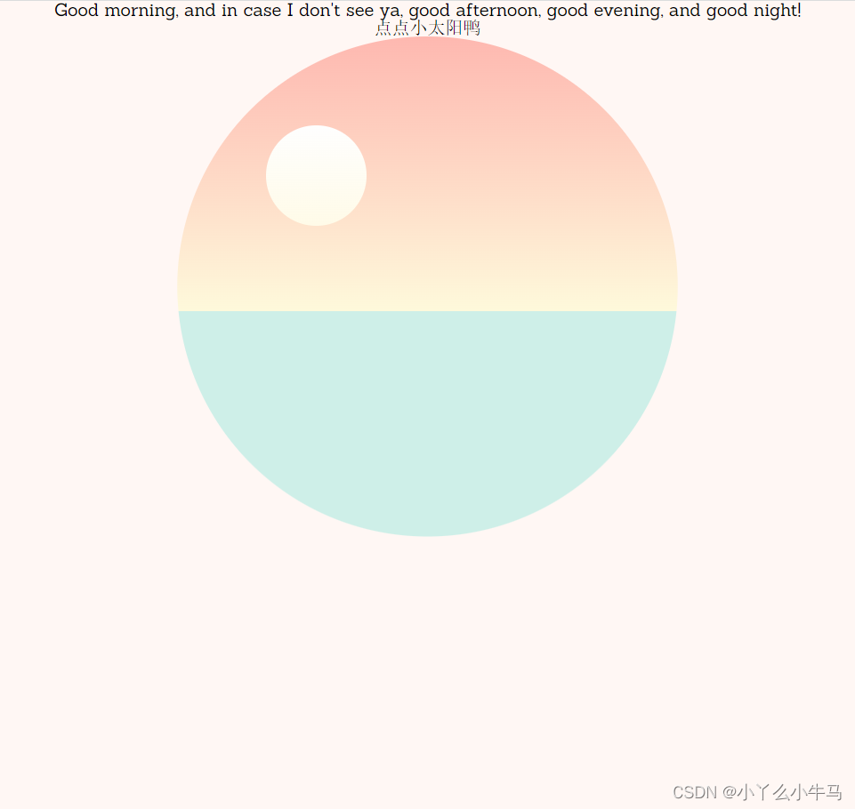
13.2 绘制夜晚时的海洋
与夜晚时的天空同理
.ocean-night { position: relative; width: 100%; height: 100%; background: -webkit-gradient( linear, left top, left bottom, from(#8da6e6), to(#788cc9) ); background: -webkit-linear-gradient(#8da6e6, #788cc9); background: -o-linear-gradient(#8da6e6, #788cc9); background: linear-gradient(#8da6e6, #788cc9); opacity: 0; -webkit-transition: opacity 3s; -o-transition: opacity 3s; transition: opacity 3s; -webkit-transition-delay: 2s; -o-transition-delay: 2s; transition-delay: 2s; z-index: 500;}.ocean-night-fade { opacity: 1;}运行效果(opacity设置为1后显示效果):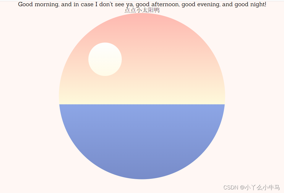
13.3丰富海洋层次感并设置浮动动画
将海洋分为三层,显得更有层次感,并绘制海洋的动画效果,使海洋浮动起来
.ocean:before,.ocean:after { width: 100%; bottom: 0; position: absolute; z-index: 200;}.ocean:before { height: 75%; background: #baeced; -webkit-animation: ocean-middle 3s infinite; animation: ocean-middle 3s infinite;}.ocean:after { height: 50%; background: #ace6f1; -webkit-animation: ocean-bottom 2s infinite; animation: ocean-bottom 2s infinite;}@-webkit-keyframes ocean-top { 0% { -webkit-transform: rotate(0deg); transform: rotate(0deg); } 25% { -webkit-transform: rotate(-1deg); transform: rotate(-1deg); } 50% { -webkit-transform: rotate(0deg); transform: rotate(0deg); } 75% { -webkit-transform: rotate(1deg); transform: rotate(1deg); } 100% { -webkit-transform: rotate(0deg); transform: rotate(0deg); }}@keyframes ocean-top { 0% { -webkit-transform: rotate(0deg); transform: rotate(0deg); } 25% { -webkit-transform: rotate(-1deg); transform: rotate(-1deg); } 50% { -webkit-transform: rotate(0deg); transform: rotate(0deg); } 75% { -webkit-transform: rotate(1deg); transform: rotate(1deg); } 100% { -webkit-transform: rotate(0deg); transform: rotate(0deg); }}@-webkit-keyframes ocean-middle { 0% { height: 75%; } 50% { height: 77%; -webkit-transform: rotate(2deg); transform: rotate(2deg); } 100% { height: 75%; }}@keyframes ocean-middle { 0% { height: 75%; } 50% { height: 77%; -webkit-transform: rotate(2deg); transform: rotate(2deg); } 100% { height: 75%; }}@-webkit-keyframes ocean-bottom { 0% { height: 50%; } 50% { height: 52%; -webkit-transform: rotate(-2deg); transform: rotate(-2deg); } 100% { height: 50%; }}@keyframes ocean-bottom { 0% { height: 50%; } 50% { height: 52%; -webkit-transform: rotate(-2deg); transform: rotate(-2deg); } 100% { height: 50%; }}运行效果:
14. 绘制小船
14.1 绘制船身
绘制船身,及切换夜晚时小船移出显示范围,同样是使用toggleClass
.boat { position: absolute; width: 50px; height: 0px; border-top: 7px solid #bb7074; border-left: 10px solid transparent; border-right: 10px solid transparent; left: 280px; /* right: -50px;*/ top: -5px; -webkit-transform-origin: center bottom; -ms-transform-origin: center bottom; transform-origin: center bottom; -webkit-animation: boat 5s infinite; animation: boat 5s infinite; -webkit-animation-delay: 0.25s; animation-delay: 0.25s; -webkit-transition: all 4s ease-in-out; -o-transition: all 4s ease-in-out; transition: all 4s ease-in-out;}.boat-sail { margin-left: -350px;}运行效果: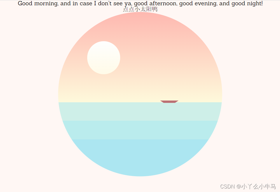
14.2 绘制船帆
.boat,.boat:before,.boat:after { position: absolute; z-index: 200;}.boat:before,.boat:after { width: 0; height: 0; border: 0 solid transparent;}.boat:before { bottom: 8px; right: -6px; border-right-width: 15px; border-left-width: 0px; border-bottom: 30px solid #bb7074;}.boat:after { bottom: 8px; right: 11px; border-right-width: 0px; border-left-width: 20px; border-bottom: 48px solid #bb7074;}运行效果: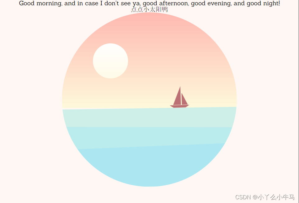
14.3 设置小船动画
设置小船在海洋上浮动的动画
@-webkit-keyframes boat { 0% { -webkit-transform: rotate(1deg)translate(2px, 0px); transform: rotate(1deg)translate(2px, 0px); } 25% { -webkit-transform: rotate(-1deg) translate(-2px, -2px); transform: rotate(-1deg) translate(-2px, -2px); } 50% { -webkit-transform: rotate(1deg) translate(1px, 0px); transform: rotate(1deg) translate(1px, 0px); } 75% { -webkit-transform: rotate(-1deg) translate(-1px, -2px); transform: rotate(-1deg) translate(-1px, -2px); } 100% { -webkit-transform: rotate(1deg) translate(2px, 0px); transform: rotate(1deg) translate(2px, 0px); }}@keyframes boat { 0% { -webkit-transform: rotate(1deg)translate(2px, 0px); transform: rotate(1deg)translate(2px, 0px); } 25% { -webkit-transform: rotate(-1deg) translate(-2px, -2px); transform: rotate(-1deg) translate(-2px, -2px); } 50% { -webkit-transform: rotate(1deg) translate(1px, 0px); transform: rotate(1deg) translate(1px, 0px); } 75% { -webkit-transform: rotate(-1deg) translate(-1px, -2px); transform: rotate(-1deg) translate(-1px, -2px); } 100% { -webkit-transform: rotate(1deg) translate(2px, 0px); transform: rotate(1deg) translate(2px, 0px); }}15. 绘制月亮
与太阳差不多
.moon { position: absolute; width: 90px; height: 90px; border-radius: 50%; background: -webkit-gradient( linear, left top, left bottom, from(#fefefe), to(#fffbe8) ); background: -webkit-linear-gradient(#fefefe, #fffbe8); background: -o-linear-gradient(#fefefe, #fffbe8); background: linear-gradient(#fefefe, #fffbe8); opacity: 0; left: 80px; margin-top: 90px; -webkit-transition: opacity 1s ease; -o-transition: opacity 1s ease; transition: opacity 1s ease;}.moon-fade { opacity: 0.3; -webkit-transition-delay: 4s; -o-transition-delay: 4s; transition-delay: 4s;}16. 绘制飞鸟
16.1 设置三只鸟儿的位置及样式
.bird:before,.bird:after { border: 2px solid #bb7074; border-bottom: 0; width: 18px; height: 8px; z-index: 200;}.bird { position: absolute; -webkit-animation: bird 1s infinite; animation: bird 1s infinite; z-index: 200; -webkit-transition: all 2s ease-in-out; -o-transition: all 2s ease-in-out; transition: all 2s ease-in-out;}.birds-fly { margin-left: 150px; margin-top: -100px;}.bird:after { border-top-left-radius: 18px; border-top-right-radius: 18px; border-right: 0; -webkit-animation: wing-right 1s infinite; animation: wing-right 1s infinite; -webkit-transform-origin: bottom left; -ms-transform-origin: bottom left; transform-origin: bottom left;}.bird:before { left: -19px; border-top-right-radius: 18px; border-top-left-radius: 18px; border-left: 0; -webkit-animation: wing-left 1s infinite; animation: wing-left 1s infinite; -webkit-transform-origin: bottom right; -ms-transform-origin: bottom right; transform-origin: bottom right;}.bird-1 { left: 240px; top: 140px; -webkit-transform: scale(0.9)rotate(10deg); -ms-transform: scale(0.9)rotate(10deg); transform: scale(0.9)rotate(10deg); -webkit-animation-delay: 0.4s; animation-delay: 0.4s;}.bird-2 { left: 280px; top: 120px; -webkit-transform: scale(0.8)rotate(-5deg); -ms-transform: scale(0.8)rotate(-5deg); transform: scale(0.8)rotate(-5deg); -webkit-animation-delay: 0.2s; animation-delay: 0.2s;}.bird-3 { left: 250px; top: 100px; -webkit-transform: scale(1)rotate(8deg); -ms-transform: scale(1)rotate(8deg); transform: scale(1)rotate(8deg);}运行效果: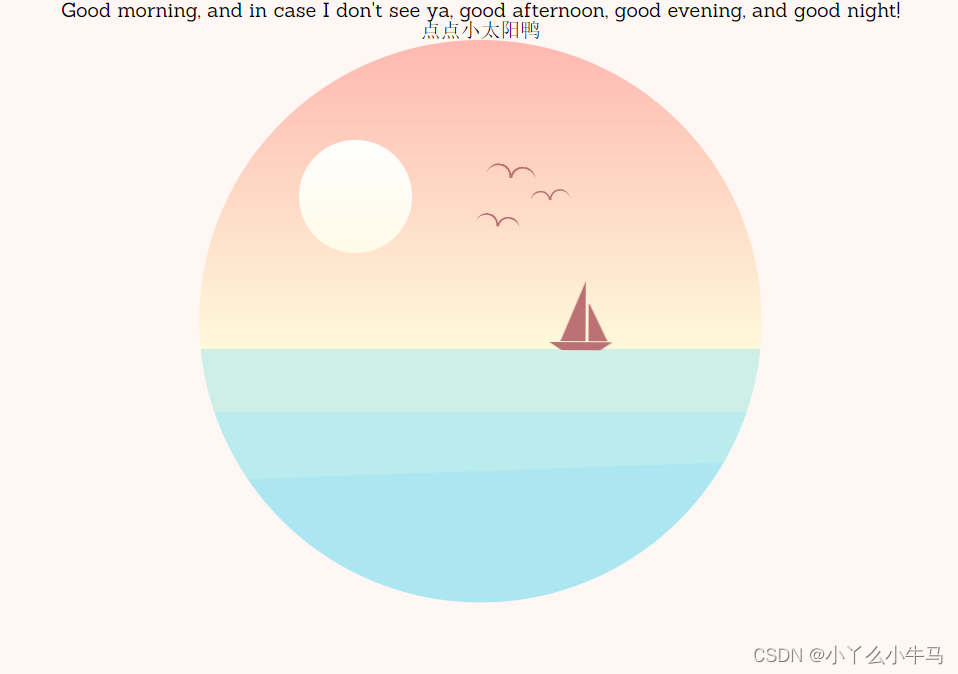
16.2 设置鸟儿飞行的动画
从小变大,展现从远处飞来的动画,以及翅膀的挥动(wing-left/wing-right),在步骤16.1中调用该动画
@-webkit-keyframes bird { 0% { -webkit-transform: translate(0px, 0px); transform: translate(0px, 0px); } 50% { -webkit-transform: translate(2px, -3px); transform: translate(2px, -3px); } 100% { -webkit-transform: translate(0px, 0px); transform: translate(0px, 0px); }}@keyframes bird { 0% { -webkit-transform: translate(0px, 0px); transform: translate(0px, 0px); } 50% { -webkit-transform: translate(2px, -3px); transform: translate(2px, -3px); } 100% { -webkit-transform: translate(0px, 0px); transform: translate(0px, 0px); }}@-webkit-keyframes wing-right { 0% { -webkit-transform: rotate(0deg); transform: rotate(0deg); } 50% { -webkit-transform: rotate(10deg); transform: rotate(10deg); } 100% { -webkit-transform: rotate(0deg); transform: rotate(0deg); }}@keyframes wing-right { 0% { -webkit-transform: rotate(0deg); transform: rotate(0deg); } 50% { -webkit-transform: rotate(10deg); transform: rotate(10deg); } 100% { -webkit-transform: rotate(0deg); transform: rotate(0deg); }}@-webkit-keyframes wing-left { 0% { -webkit-transform: rotate(0deg); transform: rotate(0deg); } 50% { -webkit-transform: rotate(-10deg); transform: rotate(-10deg); } 100% { -webkit-transform: rotate(0deg); transform: rotate(0deg); }}@keyframes wing-left { 0% { -webkit-transform: rotate(0deg); transform: rotate(0deg); } 50% { -webkit-transform: rotate(-10deg); transform: rotate(-10deg); } 100% { -webkit-transform: rotate(0deg); transform: rotate(0deg); }}运行效果:
17. 绘制山峰
首先设置山峰图层的位置,定位山峰的位置,然后绘制三个图层的山峰,黄色,粉色,红色依次对应top,middle,back三层山峰
.mountains { position: absolute; width: 100%; /* background-color: #ccc;*/ height: 20%; bottom: 35%; /* overflow: hidden;*/}.mountains-bottom { opacity: 0.5; -webkit-transform-origin: center; -ms-transform-origin: center; transform-origin: center; -webkit-transform: scaleY(-1); -ms-transform: scaleY(-1); transform: scaleY(-1); top: 0; position: fixed; overflow: hidden; height: 31.5%;}.mountains div,.mountains div:after,.mountains div:before { border-radius: 50%; position: absolute; z-index: 200;}.mountains * { -webkit-transition: background 3s ease; -o-transition: background 3s ease; transition: background 3s ease; -webkit-transition-delay: 2s; -o-transition-delay: 2s; transition-delay: 2s;}.mountain-top,.mountain-top * { background: #fffcdd;}.mountain-top { width: 200px; height: 90px; top: 18px; right: 0; margin-right: -50px;}.mountain-top-1 { position: absolute; width: 250px; height: 80px; top: 15px; right: 0; margin-right: 150px;}/*夜晚的山*/.mountain-top-night { background: #614da2;}.mountain-middle,.mountain-middle * { background: #fee1cb;}.mountain-middle { width: 180px; height: 120px; top: 12px; margin-left: 180px;}.mountain-middle-1 { width: 200px; height: 100px; top: 3px; margin-left: -110px;}.mountain-middle-2 { width: 220px; height: 150px; margin-left: -250px;}.mountain-middle-night { background: #6154a4;}.mountain-back,.mountain-back * { background: #fec6b9;}.mountain-back { width: 180px; height: 120px; top: 0px;}.mountain-back-1 { width: 200px; height: 100px; top: 3px; margin-left: 80px;}.mountain-back-2 { width: 150px; height: 80px; margin-left: 250px;}.mountain-back-night { background: #7980c8;}运行效果: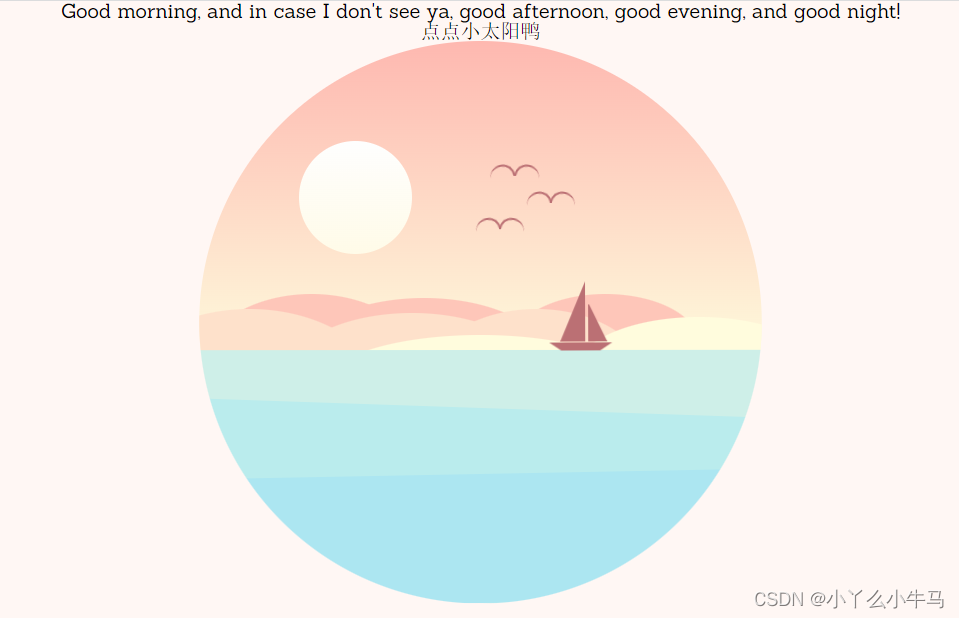
18. 绘制云朵
18.1 设置云朵图层的位置,定位云朵位置
.cloud,.cloud:after,.cloud:before { background: #fff; position: absolute; z-index: 500;}.cloud-1 { left: 310px; top: 50px;}.cloud-2 { left: 280px; top: 150px; -webkit-animation-delay: 0.2s; animation-delay: 0.2s;}.cloud-3 { left: 410px; top: 190px; -webkit-animation-delay: 0.4s; animation-delay: 0.4s;}.cloud-4 { left: 160px; top: 120px; -webkit-animation-delay: 0.6s; animation-delay: 0.6s;}.cloud-5 { left: 60px; top: 170px; -webkit-animation-delay: 0.8s; animation-delay: 0.8s;}.cloud-6 { left: 0px; top: 100px; -webkit-animation-delay: 1s; animation-delay: 1s;}18.2 绘制云朵
18.2.1
.cloud { width: 65px; height: 12px; border-radius: 20px; -webkit-animation: cloud 4s infinite; animation: cloud 4s infinite;}运行效果: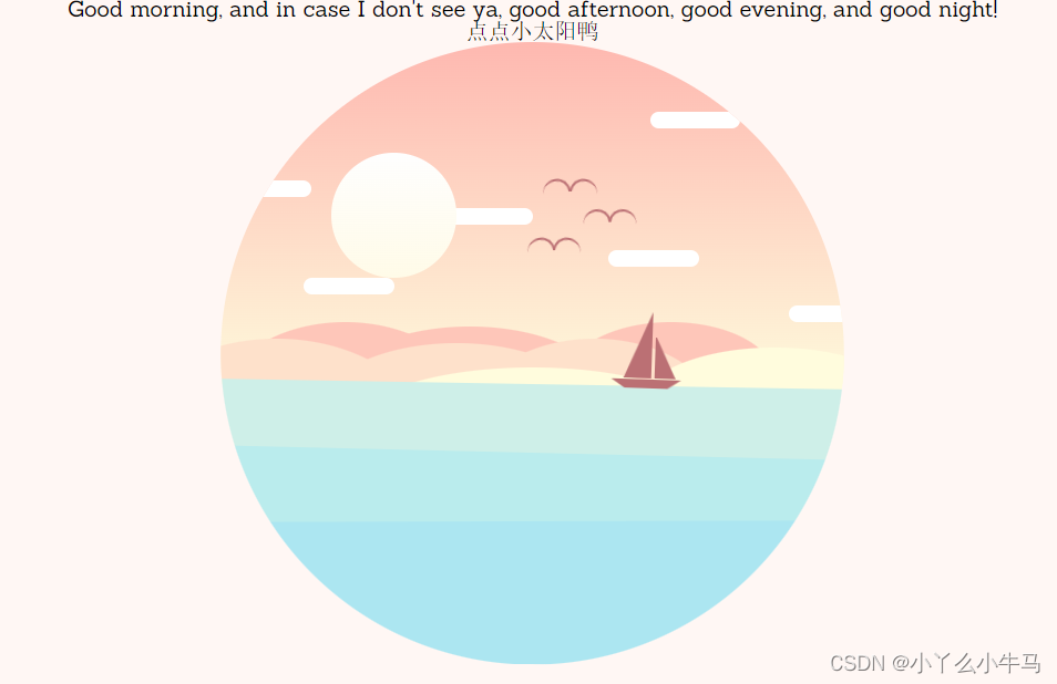
18.2.2
.cloud:after { border-radius: 50%; height: 30px; left: 27px; top: -18px; width: 30px;}运行效果: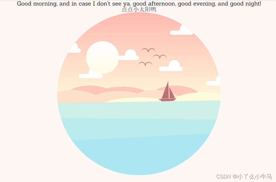
18.2.3
.cloud:before { border-radius: 50%; height: 20px; left: 12px; top: -11px; width: 20px;}运行效果: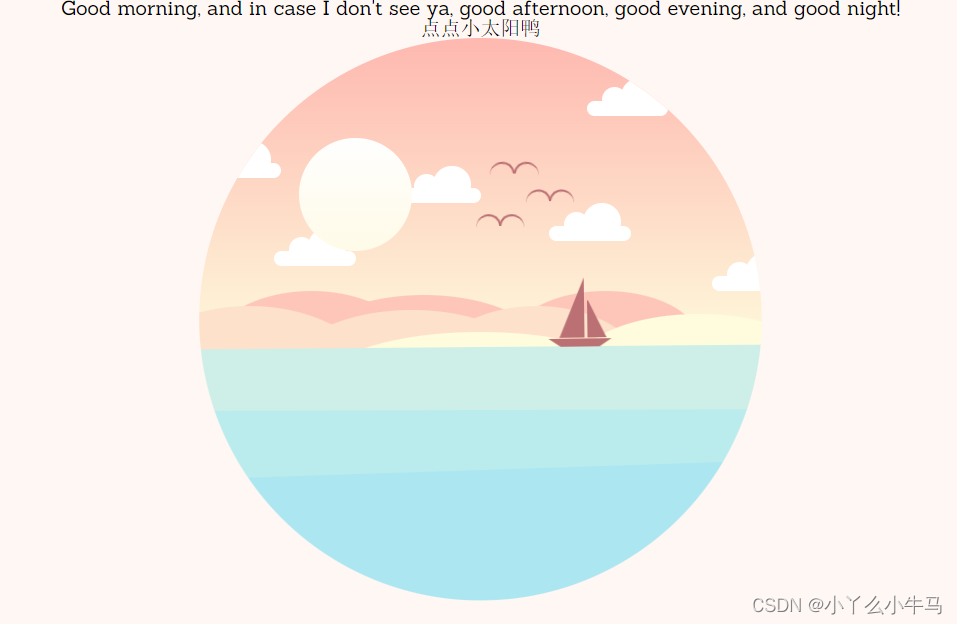
18.3 添加云朵的浮动动画
@-webkit-keyframes cloud { 0% { -webkit-transform: translate(0px, 0px); transform: translate(0px, 0px); } 25% { -webkit-transform: translate(2px, 2px); transform: translate(2px, 2px); } 50% { -webkit-transform: translate(0px, 0px); transform: translate(0px, 0px); } 75% { -webkit-transform: translate(-1px, -1px); transform: translate(-1px, -1px); } 100% { -webkit-transform: translate(0px, 0px); transform: translate(0px, 0px); }}@keyframes cloud { 0% { -webkit-transform: translate(0px, 0px); transform: translate(0px, 0px); } 25% { -webkit-transform: translate(2px, 2px); transform: translate(2px, 2px); } 50% { -webkit-transform: translate(0px, 0px); transform: translate(0px, 0px); } 75% { -webkit-transform: translate(-1px, -1px); transform: translate(-1px, -1px); } 100% { -webkit-transform: translate(0px, 0px); transform: translate(0px, 0px); }}运行效果: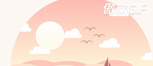
19. 绘制星星
加入小星星,并添加闪烁动画,步骤还是和之前一样
.stars *,.stars *:before,.stars *:after { border-radius: 50%; background-color: #fff; position: absolute;}.stars { opacity: 0; -webkit-transition: opacity 2s ease; -o-transition: opacity 2s ease; transition: opacity 2s ease;}.stars-fade { opacity: 1; -webkit-transition-delay: 4s; -o-transition-delay: 4s; transition-delay: 4s;}.star-group-1 { width: 5px; height: 5px; left: 225px; top: 120px; animation: twinkle 2s infinite linear;}.star-group-1:before { width: 4px; height: 4px; left: 50px; top: 18px; opacity: 0.8;}.star-group-1:after { width: 3px; height: 3px; left: -35px; top: 35px; opacity: 1;}.star-group-2 { width: 5px; height: 5px; left: 25px; top: 175px; animation: twinkle 1s infinite linear;}.star-group-2:before { width: 4px; height: 4px; left: 40px; top: 14px; opacity: 0.8;}.star-group-2:after { width: 3px; height: 3px; left: 30px; top: -40px; opacity: 1;}.star-group-3 { width: 5px; height: 5px; left: 125px; top: 50px; animation: twinkle 0.8s infinite linear;}.star-group-3:before { width: 4px; height: 4px; left: 50px; top: 20px; opacity: 0.8;}.star-group-3:after { width: 3px; height: 3px; left: 90px; top: -20px; opacity: 1;}.star-group-4 { width: 5px; height: 5px; left: 300px; top: 100px; animation: twinkle 1.2s infinite linear;}.star-group-4:before { width: 3px; height: 3px; left: 80px; top: 60px; opacity: 0.8;}.star-group-4:after { width: 3px; height: 3px; left: 50px; top: -20px; opacity: 1;}运行效果(将夜晚的opacity设置为1时):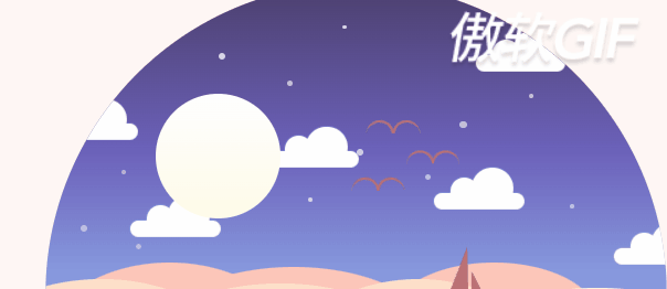
20. 绘制流星及动画
@-webkit-keyframes twinkle { 0% { opacity: 1; } 25% { opacity: 0.3; } 50% { opacity: 0.8; } 75% { opacity: 0.5; } 100% { opacity: 0.8; }}@keyframes twinkle { 0% { opacity: 1; } 25% { opacity: 0.3; } 50% { opacity: 0.8; } 75% { opacity: 0.5; } 100% { opacity: 0.8; }}.shooting-star { position: absolute; background: -webkit-gradient( linear, left top, right top, from(rgba(255, 255, 255, 1)), to(rgba(255, 255, 255, 0)) ); background: -webkit-linear-gradient( left, rgba(255, 255, 255, 1) 0%, rgba(255, 255, 255, 0) 100% ); background: -o-linear-gradient( left, rgba(255, 255, 255, 1) 0%, rgba(255, 255, 255, 0) 100% ); background: linear-gradient( to right, rgba(255, 255, 255, 1) 0%, rgba(255, 255, 255, 0) 100% ); width: 35px; height: 3px; left: 310px; top: 10px; -webkit-transform-origin: left; -ms-transform-origin: left; transform-origin: left; -webkit-transform: rotate(-40deg); -ms-transform: rotate(-40deg); transform: rotate(-40deg);}.shooting { -webkit-animation: shooting-star 2s 2 ease-in-out; animation: shooting-star 2s 2 ease-in-out; -webkit-animation-delay: 5s; animation-delay: 5s;}@-webkit-keyframes shooting-star { 100% { -webkit-transform: rotate(-40deg)translateX(-450px); transform: rotate(-40deg)translateX(-450px); }}@keyframes shooting-star { 100% { -webkit-transform: rotate(-40deg)translateX(-450px); transform: rotate(-40deg)translateX(-450px); }}21.设置字体的位置及样式
p a:link,p a:active,p a:visited { color: inherit; text-decoration: none; border-bottom: 1px dotted; border-bottom-color: inherit; opacity: 0.6;}h1,p { color: #bb7074; -webkit-transition: color 3s; -o-transition: color 3s; transition: color 3s; -webkit-transition-delay: 2s; -o-transition-delay: 2s; transition-delay: 2s; text-align: center;}h1 { margin: 60px 0 10px 0; font-size: 30px; position: relative;}p { font-size: 16px; line-height: 16px; margin: 40px; position: relative; opacity:0.6;}p#subtitle { margin-top: 10px;}.text-color { color: #7980c8;运行效果: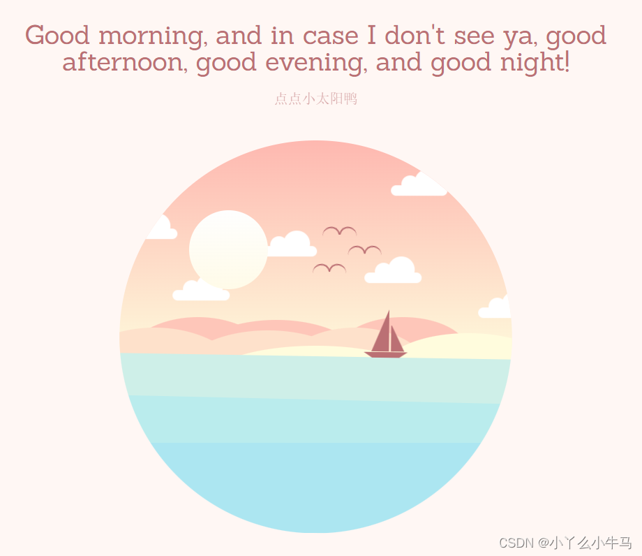
完整CSS代码
/*2.导入reset.min.css,重置浏览器标签的样式表,重新定义标签样式,覆盖浏览器的CSS默认属性,把浏览器提供的默认样式覆盖掉*/@import url("https://fonts.googleapis.com/css?family=Sanchez");* { padding: 0; margin: 0; -webkit-box-sizing: border-box; box-sizing: border-box;}*:before,*:after { content: ""; position: absolute;}/*3.设置字体样式*/html { font-family: "Sanchez", serif;}/*4.将我们的元素居中*/.container-wrapper { width: 100%; height: 100%; display: -webkit-box; display: -ms-flexbox; display: flex; -webkit-box-pack: center; -ms-flex-pack: center; justify-content: center; -webkit-box-align: center; -ms-flex-align: center; align-items: center; -webkit-box-orient: vertical; -webkit-box-direction: normal; -ms-flex-direction: column; flex-direction: column;}/*5.设置背景颜色*/html { -webkit-transition: background-color 3s ease; -o-transition: background-color 3s ease; transition: background-color 3s ease; -webkit-transition-delay: 2s; -o-transition-delay: 2s; transition-delay: 2s; background-color: #fff7f4;}/*6.设置动画显示的位置,子绝父相,这是父元素,设置为相对定位*/.container { width: 450px; height: 450px; position: relative;}/*7.设置夜晚时的背景色,我们将会在js中使用它*/.container-night { background-color: #e4ecff;}/*8.根据最终效果,我们将动画显示的区域设置为原型*/.circle-container { width: 450px; height: 450px; -webkit-clip-path: circle(50% at 50% 50%); clip-path: circle(50% at 50% 50%); position: absolute; overflow: hidden; z-index: 100;}/*9.绘制白天时天空的样子*/.sky { position: absolute; width: 100%; height: 55%; top: 0; background: -webkit-gradient( linear, left top, left bottom, from(#feb8b0), to(#fef9db) ); background: -webkit-linear-gradient(#feb8b0, #fef9db); background: -o-linear-gradient(#feb8b0, #fef9db); background: linear-gradient(#feb8b0, #fef9db); z-index: 1; overflow: hidden;}/*10.绘制夜晚时天空的样子,我们使用opacity属性,将其设置为不可见,在js中使用toggleClass方法将该属性切换为1,使其可见。运行效果的图中将该属性设置为了1,方便大家先看到效果*/.sky-night { position: absolute; width: 100%; height: 100%; background: -webkit-gradient( linear, left top, left bottom, from(#4c3f6d), color-stop(#6c62bb), to(#93b1ed) ); background: -webkit-linear-gradient(#4c3f6d, #6c62bb, #93b1ed); background: -o-linear-gradient(#4c3f6d, #6c62bb, #93b1ed); background: linear-gradient(#4c3f6d, #6c62bb, #93b1ed); opacity: 0; -webkit-transition: opacity 3s; -o-transition: opacity 3s; transition: opacity 3s; -webkit-transition-delay: 2s; -o-transition-delay: 2s; transition-delay: 2s;}/*用于切换opacity属性*/.sky-night-fade { opacity: 1;}/*11.@-webkit-keyframes 创建动画,设置昼夜交替时天空的变换过程0%为开头动画,100%为动画完成*/@-webkit-keyframes sky-night { 0% { background: -webkit-gradient( linear, left top, left bottom, from(#feb8b0), to(#fef9db) ); background: -webkit-linear-gradient(#feb8b0, #fef9db); background: linear-gradient(#feb8b0, #fef9db); } 100% { background: -webkit-gradient( linear, left top, left bottom, from(#4c3f6d), to(#96b5ee) ); background: -webkit-linear-gradient(#4c3f6d, #96b5ee); background: linear-gradient(#4c3f6d, #96b5ee); }}@keyframes sky-night { 0% { background: -webkit-gradient( linear, left top, left bottom, from(#feb8b0), to(#fef9db) ); background: -webkit-linear-gradient(#feb8b0, #fef9db); background: -o-linear-gradient(#feb8b0, #fef9db); background: linear-gradient(#feb8b0, #fef9db); } 100% { background: -webkit-gradient( linear, left top, left bottom, from(#4c3f6d), to(#96b5ee) ); background: -webkit-linear-gradient(#4c3f6d, #96b5ee); background: -o-linear-gradient(#4c3f6d, #96b5ee); background: linear-gradient(#4c3f6d, #96b5ee); }}/*12.设置太阳的位置,并绘制太阳*/.sun-container { z-index: 10; position: absolute; left: 0; right: 0; margin: auto; top: 0; bottom: 0; width: 290px; height: 290px; /* background-color: rgba(255, 0, 255, 0.2);*/ -webkit-transform-origin: center center; -ms-transform-origin: center center; transform-origin: center center; -webkit-transition: all 5s ease-in-out; -o-transition: all 5s ease-in-out; transition: all 5s ease-in-out;}.sun { position: absolute; width: 90px; height: 90px; border-radius: 50%; background: -webkit-gradient( linear, left top, left bottom, from(#fefefe), to(#fffbe8) ); background: -webkit-linear-gradient(#fefefe, #fffbe8); background: -o-linear-gradient(#fefefe, #fffbe8); background: linear-gradient(#fefefe, #fffbe8); cursor: pointer; z-index: 10;}/*13.绘制海洋部分,及其动画效果,同样使用toggleClass设置动画停止后,海洋的样式*/.ocean { position: absolute; width: 100%; height: 45%; bottom: 0; background: #ceefe8; z-index: 200; -webkit-animation: ocean-top 3s infinite; animation: ocean-top 3s infinite; opacity: 1; -webkit-transition: all 3s ease; -o-transition: all 3s ease; transition: all 3s ease; -webkit-transition-delay: 2s; -o-transition-delay: 2s; transition-delay: 2s; -webkit-transform-origin: top; -ms-transform-origin: top; transform-origin: top;}.animation-stop { -webkit-animation: ocean-top 3s forwards; animation: ocean-top 3s forwards; height: 42%;}/*14.绘制夜晚时的海洋,与夜晚时的天空同理*/.ocean-night { position: relative; width: 100%; height: 100%; background: -webkit-gradient( linear, left top, left bottom, from(#8da6e6), to(#788cc9) ); background: -webkit-linear-gradient(#8da6e6, #788cc9); background: -o-linear-gradient(#8da6e6, #788cc9); background: linear-gradient(#8da6e6, #788cc9); opacity: 0; -webkit-transition: opacity 3s; -o-transition: opacity 3s; transition: opacity 3s; -webkit-transition-delay: 2s; -o-transition-delay: 2s; transition-delay: 2s; z-index: 500;}.ocean-night-fade { opacity: 1;}/*15.将海洋分为三层,显得更有层次感,并绘制海洋的动画效果,使海洋浮动起来*/.ocean:before,.ocean:after { width: 100%; bottom: 0; position: absolute; z-index: 200;}.ocean:before { height: 75%; background: #baeced; -webkit-animation: ocean-middle 3s infinite; animation: ocean-middle 3s infinite;}.ocean:after { height: 50%; background: #ace6f1; -webkit-animation: ocean-bottom 2s infinite; animation: ocean-bottom 2s infinite;}@-webkit-keyframes ocean-top { 0% { -webkit-transform: rotate(0deg); transform: rotate(0deg); } 25% { -webkit-transform: rotate(-1deg); transform: rotate(-1deg); } 50% { -webkit-transform: rotate(0deg); transform: rotate(0deg); } 75% { -webkit-transform: rotate(1deg); transform: rotate(1deg); } 100% { -webkit-transform: rotate(0deg); transform: rotate(0deg); }}@keyframes ocean-top { 0% { -webkit-transform: rotate(0deg); transform: rotate(0deg); } 25% { -webkit-transform: rotate(-1deg); transform: rotate(-1deg); } 50% { -webkit-transform: rotate(0deg); transform: rotate(0deg); } 75% { -webkit-transform: rotate(1deg); transform: rotate(1deg); } 100% { -webkit-transform: rotate(0deg); transform: rotate(0deg); }}@-webkit-keyframes ocean-middle { 0% { height: 75%; } 50% { height: 77%; -webkit-transform: rotate(2deg); transform: rotate(2deg); } 100% { height: 75%; }}@keyframes ocean-middle { 0% { height: 75%; } 50% { height: 77%; -webkit-transform: rotate(2deg); transform: rotate(2deg); } 100% { height: 75%; }}@-webkit-keyframes ocean-bottom { 0% { height: 50%; } 50% { height: 52%; -webkit-transform: rotate(-2deg); transform: rotate(-2deg); } 100% { height: 50%; }}@keyframes ocean-bottom { 0% { height: 50%; } 50% { height: 52%; -webkit-transform: rotate(-2deg); transform: rotate(-2deg); } 100% { height: 50%; }}/*16.绘制小船,及切换夜晚时小船移出显示范围,同样是使用toggleClass*/.boat { position: absolute; width: 50px; height: 0px; border-top: 7px solid #bb7074; border-left: 10px solid transparent; border-right: 10px solid transparent; left: 280px; /* right: -50px;*/ top: -5px; -webkit-transform-origin: center bottom; -ms-transform-origin: center bottom; transform-origin: center bottom; -webkit-animation: boat 5s infinite; animation: boat 5s infinite; -webkit-animation-delay: 0.25s; animation-delay: 0.25s; -webkit-transition: all 4s ease-in-out; -o-transition: all 4s ease-in-out; transition: all 4s ease-in-out;}.boat-sail { margin-left: -350px;}/*17.绘制船帆*/.boat,.boat:before,.boat:after { position: absolute; z-index: 200;}.boat:before,.boat:after { width: 0; height: 0; border: 0 solid transparent;}.boat:before { bottom: 8px; right: -6px; border-right-width: 15px; border-left-width: 0px; border-bottom: 30px solid #bb7074;}.boat:after { bottom: 8px; right: 11px; border-right-width: 0px; border-left-width: 20px; border-bottom: 48px solid #bb7074;}/*17.设置小船在海洋上浮动的动画*/@-webkit-keyframes boat { 0% { -webkit-transform: rotate(1deg)translate(2px, 0px); transform: rotate(1deg)translate(2px, 0px); } 25% { -webkit-transform: rotate(-1deg) translate(-2px, -2px); transform: rotate(-1deg) translate(-2px, -2px); } 50% { -webkit-transform: rotate(1deg) translate(1px, 0px); transform: rotate(1deg) translate(1px, 0px); } 75% { -webkit-transform: rotate(-1deg) translate(-1px, -2px); transform: rotate(-1deg) translate(-1px, -2px); } 100% { -webkit-transform: rotate(1deg) translate(2px, 0px); transform: rotate(1deg) translate(2px, 0px); }}@keyframes boat { 0% { -webkit-transform: rotate(1deg)translate(2px, 0px); transform: rotate(1deg)translate(2px, 0px); } 25% { -webkit-transform: rotate(-1deg) translate(-2px, -2px); transform: rotate(-1deg) translate(-2px, -2px); } 50% { -webkit-transform: rotate(1deg) translate(1px, 0px); transform: rotate(1deg) translate(1px, 0px); } 75% { -webkit-transform: rotate(-1deg) translate(-1px, -2px); transform: rotate(-1deg) translate(-1px, -2px); } 100% { -webkit-transform: rotate(1deg) translate(2px, 0px); transform: rotate(1deg) translate(2px, 0px); }}/*18.绘制月亮,与太阳差不多*/.moon { position: absolute; width: 90px; height: 90px; border-radius: 50%; background: -webkit-gradient( linear, left top, left bottom, from(#fefefe), to(#fffbe8) ); background: -webkit-linear-gradient(#fefefe, #fffbe8); background: -o-linear-gradient(#fefefe, #fffbe8); background: linear-gradient(#fefefe, #fffbe8); opacity: 0; left: 80px; margin-top: 90px; -webkit-transition: opacity 1s ease; -o-transition: opacity 1s ease; transition: opacity 1s ease;}.moon-fade { opacity: 0.3; -webkit-transition-delay: 4s; -o-transition-delay: 4s; transition-delay: 4s;}/*19.设置三只鸟儿的位置及样式*/.bird:before,.bird:after { border: 2px solid #bb7074; border-bottom: 0; width: 18px; height: 8px; z-index: 200;}.bird { position: absolute; -webkit-animation: bird 1s infinite; animation: bird 1s infinite; z-index: 200; -webkit-transition: all 2s ease-in-out; -o-transition: all 2s ease-in-out; transition: all 2s ease-in-out;}.birds-fly { margin-left: 150px; margin-top: -100px;}.bird:after { border-top-left-radius: 18px; border-top-right-radius: 18px; border-right: 0; -webkit-animation: wing-right 1s infinite; animation: wing-right 1s infinite; -webkit-transform-origin: bottom left; -ms-transform-origin: bottom left; transform-origin: bottom left;}.bird:before { left: -19px; border-top-right-radius: 18px; border-top-left-radius: 18px; border-left: 0; -webkit-animation: wing-left 1s infinite; animation: wing-left 1s infinite; -webkit-transform-origin: bottom right; -ms-transform-origin: bottom right; transform-origin: bottom right;}.bird-1 { left: 240px; top: 140px; -webkit-transform: scale(0.9)rotate(10deg); -ms-transform: scale(0.9)rotate(10deg); transform: scale(0.9)rotate(10deg); -webkit-animation-delay: 0.4s; animation-delay: 0.4s;}.bird-2 { left: 280px; top: 120px; -webkit-transform: scale(0.8)rotate(-5deg); -ms-transform: scale(0.8)rotate(-5deg); transform: scale(0.8)rotate(-5deg); -webkit-animation-delay: 0.2s; animation-delay: 0.2s;}.bird-3 { left: 250px; top: 100px; -webkit-transform: scale(1)rotate(8deg); -ms-transform: scale(1)rotate(8deg); transform: scale(1)rotate(8deg);}/*20.设置鸟儿飞行的动画,从小变大,展现从远处飞来的动画,以及翅膀的挥动(wing-left/wing-right),在步骤19中调用该动画*/@-webkit-keyframes bird { 0% { -webkit-transform: translate(0px, 0px); transform: translate(0px, 0px); } 50% { -webkit-transform: translate(2px, -3px); transform: translate(2px, -3px); } 100% { -webkit-transform: translate(0px, 0px); transform: translate(0px, 0px); }}@keyframes bird { 0% { -webkit-transform: translate(0px, 0px); transform: translate(0px, 0px); } 50% { -webkit-transform: translate(2px, -3px); transform: translate(2px, -3px); } 100% { -webkit-transform: translate(0px, 0px); transform: translate(0px, 0px); }}@-webkit-keyframes wing-right { 0% { -webkit-transform: rotate(0deg); transform: rotate(0deg); } 50% { -webkit-transform: rotate(10deg); transform: rotate(10deg); } 100% { -webkit-transform: rotate(0deg); transform: rotate(0deg); }}@keyframes wing-right { 0% { -webkit-transform: rotate(0deg); transform: rotate(0deg); } 50% { -webkit-transform: rotate(10deg); transform: rotate(10deg); } 100% { -webkit-transform: rotate(0deg); transform: rotate(0deg); }}@-webkit-keyframes wing-left { 0% { -webkit-transform: rotate(0deg); transform: rotate(0deg); } 50% { -webkit-transform: rotate(-10deg); transform: rotate(-10deg); } 100% { -webkit-transform: rotate(0deg); transform: rotate(0deg); }}@keyframes wing-left { 0% { -webkit-transform: rotate(0deg); transform: rotate(0deg); } 50% { -webkit-transform: rotate(-10deg); transform: rotate(-10deg); } 100% { -webkit-transform: rotate(0deg); transform: rotate(0deg); }}/*21.首先设置山峰图层的位置,定位山峰的位置,然后绘制三个图层的山峰,黄色,粉色,红色依次对应top,middle,back三层山峰*/.mountains { position: absolute; width: 100%; /* background-color: #ccc;*/ height: 20%; bottom: 35%; /* overflow: hidden;*/}.mountains-bottom { opacity: 0.5; -webkit-transform-origin: center; -ms-transform-origin: center; transform-origin: center; -webkit-transform: scaleY(-1); -ms-transform: scaleY(-1); transform: scaleY(-1); top: 0; position: fixed; overflow: hidden; height: 31.5%;}.mountains div,.mountains div:after,.mountains div:before { border-radius: 50%; position: absolute; z-index: 200;}.mountains * { -webkit-transition: background 3s ease; -o-transition: background 3s ease; transition: background 3s ease; -webkit-transition-delay: 2s; -o-transition-delay: 2s; transition-delay: 2s;}.mountain-top,.mountain-top * { background: #fffcdd;}.mountain-top { width: 200px; height: 90px; top: 18px; right: 0; margin-right: -50px;}.mountain-top-1 { position: absolute; width: 250px; height: 80px; top: 15px; right: 0; margin-right: 150px;}/*夜晚的山*/.mountain-top-night { background: #614da2;}.mountain-middle,.mountain-middle * { background: #fee1cb;}.mountain-middle { width: 180px; height: 120px; top: 12px; margin-left: 180px;}.mountain-middle-1 { width: 200px; height: 100px; top: 3px; margin-left: -110px;}.mountain-middle-2 { width: 220px; height: 150px; margin-left: -250px;}.mountain-middle-night { background: #6154a4;}.mountain-back,.mountain-back * { background: #fec6b9;}.mountain-back { width: 180px; height: 120px; top: 0px;}.mountain-back-1 { width: 200px; height: 100px; top: 3px; margin-left: 80px;}.mountain-back-2 { width: 150px; height: 80px; margin-left: 250px;}.mountain-back-night { background: #7980c8;}/*22.设置云朵图层的位置,定位云朵位置。*/.cloud,.cloud:after,.cloud:before { background: #fff; position: absolute; z-index: 500;}.cloud-1 { left: 310px; top: 50px;}.cloud-2 { left: 280px; top: 150px; -webkit-animation-delay: 0.2s; animation-delay: 0.2s;}.cloud-3 { left: 410px; top: 190px; -webkit-animation-delay: 0.4s; animation-delay: 0.4s;}.cloud-4 { left: 160px; top: 120px; -webkit-animation-delay: 0.6s; animation-delay: 0.6s;}.cloud-5 { left: 60px; top: 170px; -webkit-animation-delay: 0.8s; animation-delay: 0.8s;}.cloud-6 { left: 0px; top: 100px; -webkit-animation-delay: 1s; animation-delay: 1s;}/*23.绘制云朵*/.cloud { width: 65px; height: 12px; border-radius: 20px; -webkit-animation: cloud 4s infinite; animation: cloud 4s infinite;}/*24.*/.cloud:after { border-radius: 50%; height: 30px; left: 27px; top: -18px; width: 30px;}/*25.*/.cloud:before { border-radius: 50%; height: 20px; left: 12px; top: -11px; width: 20px;}/*26.添加云朵的浮动动画*/@-webkit-keyframes cloud { 0% { -webkit-transform: translate(0px, 0px); transform: translate(0px, 0px); } 25% { -webkit-transform: translate(2px, 2px); transform: translate(2px, 2px); } 50% { -webkit-transform: translate(0px, 0px); transform: translate(0px, 0px); } 75% { -webkit-transform: translate(-1px, -1px); transform: translate(-1px, -1px); } 100% { -webkit-transform: translate(0px, 0px); transform: translate(0px, 0px); }}@keyframes cloud { 0% { -webkit-transform: translate(0px, 0px); transform: translate(0px, 0px); } 25% { -webkit-transform: translate(2px, 2px); transform: translate(2px, 2px); } 50% { -webkit-transform: translate(0px, 0px); transform: translate(0px, 0px); } 75% { -webkit-transform: translate(-1px, -1px); transform: translate(-1px, -1px); } 100% { -webkit-transform: translate(0px, 0px); transform: translate(0px, 0px); }}/*27.加入小星星,并添加闪烁动画,步骤还是和之前一样*/.stars *,.stars *:before,.stars *:after { border-radius: 50%; background-color: #fff; position: absolute;}.stars { opacity: 0; -webkit-transition: opacity 2s ease; -o-transition: opacity 2s ease; transition: opacity 2s ease;}.stars-fade { opacity: 1; -webkit-transition-delay: 4s; -o-transition-delay: 4s; transition-delay: 4s;}.star-group-1 { width: 5px; height: 5px; left: 225px; top: 120px; animation: twinkle 2s infinite linear;}.star-group-1:before { width: 4px; height: 4px; left: 50px; top: 18px; opacity: 0.8;}.star-group-1:after { width: 3px; height: 3px; left: -35px; top: 35px; opacity: 1;}.star-group-2 { width: 5px; height: 5px; left: 25px; top: 175px; animation: twinkle 1s infinite linear;}.star-group-2:before { width: 4px; height: 4px; left: 40px; top: 14px; opacity: 0.8;}.star-group-2:after { width: 3px; height: 3px; left: 30px; top: -40px; opacity: 1;}.star-group-3 { width: 5px; height: 5px; left: 125px; top: 50px; animation: twinkle 0.8s infinite linear;}.star-group-3:before { width: 4px; height: 4px; left: 50px; top: 20px; opacity: 0.8;}.star-group-3:after { width: 3px; height: 3px; left: 90px; top: -20px; opacity: 1;}.star-group-4 { width: 5px; height: 5px; left: 300px; top: 100px; animation: twinkle 1.2s infinite linear;}.star-group-4:before { width: 3px; height: 3px; left: 80px; top: 60px; opacity: 0.8;}.star-group-4:after { width: 3px; height: 3px; left: 50px; top: -20px; opacity: 1;}/*28.绘制流星及动画*/@-webkit-keyframes twinkle { 0% { opacity: 1; } 25% { opacity: 0.3; } 50% { opacity: 0.8; } 75% { opacity: 0.5; } 100% { opacity: 0.8; }}@keyframes twinkle { 0% { opacity: 1; } 25% { opacity: 0.3; } 50% { opacity: 0.8; } 75% { opacity: 0.5; } 100% { opacity: 0.8; }}.shooting-star { position: absolute; background: -webkit-gradient( linear, left top, right top, from(rgba(255, 255, 255, 1)), to(rgba(255, 255, 255, 0)) ); background: -webkit-linear-gradient( left, rgba(255, 255, 255, 1) 0%, rgba(255, 255, 255, 0) 100% ); background: -o-linear-gradient( left, rgba(255, 255, 255, 1) 0%, rgba(255, 255, 255, 0) 100% ); background: linear-gradient( to right, rgba(255, 255, 255, 1) 0%, rgba(255, 255, 255, 0) 100% ); width: 35px; height: 3px; left: 310px; top: 10px; -webkit-transform-origin: left; -ms-transform-origin: left; transform-origin: left; -webkit-transform: rotate(-40deg); -ms-transform: rotate(-40deg); transform: rotate(-40deg);}.shooting { -webkit-animation: shooting-star 2s 2 ease-in-out; animation: shooting-star 2s 2 ease-in-out; -webkit-animation-delay: 5s; animation-delay: 5s;}@-webkit-keyframes shooting-star { 100% { -webkit-transform: rotate(-40deg)translateX(-450px); transform: rotate(-40deg)translateX(-450px); }}@keyframes shooting-star { 100% { -webkit-transform: rotate(-40deg)translateX(-450px); transform: rotate(-40deg)translateX(-450px); }}/*29.设置字体的位置及样式*/p a:link,p a:active,p a:visited { color: inherit; text-decoration: none; border-bottom: 1px dotted; border-bottom-color: inherit; opacity: 0.6;}h1,p { color: #bb7074; -webkit-transition: color 3s; -o-transition: color 3s; transition: color 3s; -webkit-transition-delay: 2s; -o-transition-delay: 2s; transition-delay: 2s; text-align: center;}h1 { margin: 60px 0 10px 0; font-size: 30px; position: relative;}p { font-size: 16px; line-height: 16px; margin: 40px; position: relative; opacity:0.6;}p#subtitle { margin-top: 10px;}.text-color { color: #7980c8;}三、JS(index.js)
22. 设置元素间属性转换
js部分主要是元素的变换,日夜交替时,显示或者隐藏某个元素,较为简单
$(function () { $('.sun').click(function (e) { e.stopPropagation(); $("html").toggleClass('container-night'); $(".sky-night").toggleClass('sky-night-fade'); $("p, h1").toggleClass('text-color'); $(".ocean-night").toggleClass('ocean-night-fade'); $(".moon").toggleClass('moon-fade'); $(".ocean").toggleClass('animation-stop'); $(".bird").toggleClass('birds-fly'); $(".boat").toggleClass('boat-sail'); $(".mountain-top, .mountain-top >*").toggleClass('mountain-top-night'); $(".mountain-middle, .mountain-middle >*").toggleClass('mountain-middle-night'); $(".mountain-back, .mountain-back >*").toggleClass('mountain-back-night'); $(".cloud").delay(2500).fadeToggle(2500); $(".stars").toggleClass('stars-fade'); $(".shooting-star").toggleClass('shooting'); var angle = ($('.sun-container').data('angle') + 360) || 360; $('.sun-container').css({ 'transform': 'rotate(' + angle + 'deg)' }); $('.sun-container').data('angle', angle); });});至此,我们的纯代码绘制动画就完成啦!
运行效果: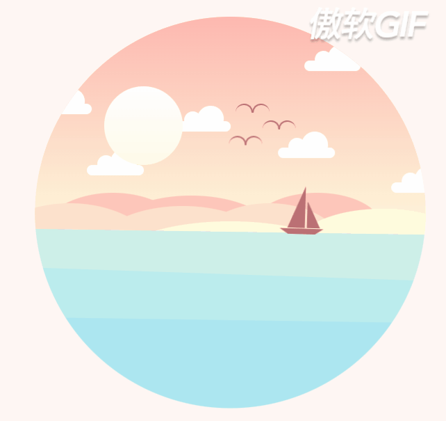
总结
Good morning, and in case I don’t see ya, good afternoon, good evening, and good night!
感谢大家支持!再次祝大家早安晚安,每日安好鸭!