文章目录
前言效果图HTML篇CSS篇1. 盒子模型设置2. 动画设置 完整代码
前言
我是前端小刘不怕牛牛,love you 3000,愿你能遇到值得的人。
今天分享一个唯美的文字闪烁CSS特效
希望大家能喜欢
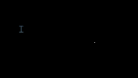
效果图
HTML篇
代码:
<div class="main"> <div> <span>I</span></div> <div> <span>l</span> <span>o</span> <span>v</span> <span>e</span></div> <div> <span>y</span> <span>o</span> <span>u</span></div> <div> <span>3</span> <span>0</span> <span>0</span> <span>0</span></div></div>display转换div的元素显示模式为inline-block这里可能小伙伴会有疑问为什么还要用div将每个单词保住,这里是因为后面用flex布局,让单词之间自动设置间隙,整体更加好看 CSS篇
1. 盒子模型设置
代码如下:
body{ background-color: black; } .main{ padding-top: 249px; margin: 0 auto; width: 1200px; display: flex; justify-content: space-around; font-family: 'Courier New', Courier, monospace; } .main div{ display: inline-block; color: transparent; } span{ font-size: 120px; animation: twinkle 4.6s linear infinite; }justify-content属性,display为flex的父元素的子元素称为项目,而space-around属性值,则使项目之间根据父元素宽度平均分布间隔,(两端与项目之间也会分配间隔,为项目与项目之间间隔的一半,这个在案例中不重要)这里对span标签选择,设置动画,animation属性可以连写 第一个值twinkle为动画名字第二个为duration,动画播放时长第三个值为timing-function,时间过渡曲线,linear为线性过渡,动画播放无倍数变换第四个值为播放次数,infinity为无限循环将文字颜色设置为透明,当然也可以用opacity 2. 动画设置
代码如下:
.main div:nth-child(1) span:nth-child(1){ animation-delay: 0s; } .main div:nth-child(2) span:nth-child(1){ animation-delay: 0.4s; } .main div:nth-child(2) span:nth-child(2){ animation-delay: 0.8s; } .main div:nth-child(2) span:nth-child(3){ animation-delay: 1.2s; } .main div:nth-child(2) span:nth-child(4){ animation-delay: 1.6s; } .main div:nth-child(3) span:nth-child(1){ animation-delay: 2.0s; } .main div:nth-child(3) span:nth-child(2){ animation-delay: 2.4s; } .main div:nth-child(3) span:nth-child(3){ animation-delay: 2.8s; } .main div:nth-child(4) span:nth-child(1){ animation-delay: 3.2s; } .main div:nth-child(4) span:nth-child(2){ animation-delay: 3.6s; } .main div:nth-child(4) span:nth-child(3){ animation-delay: 4s; } .main div:nth-child(4) span:nth-child(4){ animation-delay: 4.4s; } @keyframes twinkle{ 0%{ color: transparent; } 100%{ color: aliceblue; text-shadow: 0 0 4px skyblue, 0 0 10px skyblue, 0 0 20px skyblue, 0 0 30px skyblue, 0 0 40px skyblue, 0 0 50px skyblue, 0 0 60px skyblue, 0 0 70px skyblue, 0 0 80px skyblue, 0 0 90px skyblue, 0 0 100px skyblue, 0 0 110px skyblue, 0 0 120px skyblue, 0 0 130px skyblue; /* 文字阴影叠加 */ } }(随便叠了一个)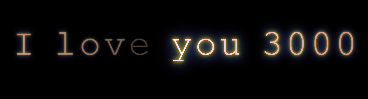
完整代码
代码如下:
<!DOCTYPE html><html lang="en"><head> <meta charset="UTF-8"> <meta http-equiv="X-UA-Compatible" content="IE=edge"> <meta name="viewport" content="width=device-width, initial-scale=1.0"> <title>文字闪烁效果</title> <style> body{ background-color: black; } .main{ padding-top: 249px; margin: 0 auto; width: 1200px; display: flex; justify-content: space-around; font-family: 'Courier New', Courier, monospace; } .main div{ display: inline-block; color: transparent; } span{ font-size: 120px; animation: twinkle 4.6s linear infinite; } .main div:nth-child(1) span:nth-child(1){ animation-delay: 0s; } .main div:nth-child(2) span:nth-child(1){ animation-delay: 0.4s; } .main div:nth-child(2) span:nth-child(2){ animation-delay: 0.8s; } .main div:nth-child(2) span:nth-child(3){ animation-delay: 1.2s; } .main div:nth-child(2) span:nth-child(4){ animation-delay: 1.6s; } .main div:nth-child(3) span:nth-child(1){ animation-delay: 2.0s; } .main div:nth-child(3) span:nth-child(2){ animation-delay: 2.4s; } .main div:nth-child(3) span:nth-child(3){ animation-delay: 2.8s; } .main div:nth-child(4) span:nth-child(1){ animation-delay: 3.2s; } .main div:nth-child(4) span:nth-child(2){ animation-delay: 3.6s; } .main div:nth-child(4) span:nth-child(3){ animation-delay: 4s; } .main div:nth-child(4) span:nth-child(4){ animation-delay: 4.4s; } @keyframes twinkle{ 0%{ color: transparent; } 100%{ color: aliceblue; text-shadow: 0 0 4px skyblue, 0 0 10px skyblue, 0 0 20px skyblue, 0 0 30px skyblue, 0 0 40px skyblue, 0 0 50px skyblue, 0 0 60px skyblue, 0 0 70px skyblue, 0 0 80px skyblue, 0 0 90px skyblue, 0 0 100px skyblue, 0 0 110px skyblue, 0 0 120px skyblue, 0 0 130px skyblue; /* 文字阴影叠加 */ /* text-shadow: 0 0 4px red, 0 0 10px orange, 0 0 20px yellow, 0 0 30px green, 0 0 40px blue, 0 0 50px skyblue, 0 0 60px blueviolet; */ } } </style></head><body> <div class="main"> <div> <span>I</span></div> <div> <span>l</span> <span>o</span> <span>v</span> <span>e</span></div> <div> <span>y</span> <span>o</span> <span>u</span></div> <div> <span>3</span> <span>0</span> <span>0</span> <span>0</span></div> </div></body></html>今天的小案例到这就结束啦,如果觉得好玩有帮助的可以用小手点个攒关注下吗,牛牛后面会陆续更新好玩的CSS特效,还有JS的页面效果实现???