这一篇,我们一起学习 Jetpack Compose 中的部分控件 – Text、TextField、Button,掌握其使用方式和特性。
文中代码均基于 1.0.1版本
如无特殊说明,下文中的 Compose 均指代 Jetpack compose
小互动
上一篇文章:Compose | 一文理解神奇的Modifier 在郭婶的号上有读者评论到不知道Compose从何学起,
无从下手,这里简单的谈一谈我的看法:
- Compose 以及 Jetpack Compose 对于Android从业人员而言确实是一门
全新的技术 - 目前才兴起,还没有达到一个辉煌的阶段
在此背景下,开始学习研究Compose 都可以算的上 先行者,而且这门技术还做不到诸如:“一年内全面替代老技术”、“不掌握就找不到工作” 这种程度。
那么按部就班的学习它就行了,没有时间上的紧迫感。而学习一样东西,有这样几个阶段:
- 掌握如何使用
- 掌握实现细节,逐渐理解其本质
- 从其本质出发,利用对程序的理解,优化使用方式甚至优化这门技术
显然,我们现在要做的就是:
- 先结合官方资料以及源码,先掌握如何使用:
它解决哪些问题,怎么使用它解决问题 - 鉴于部分读者已经有一定的基础,对类似技术有了一定的理解,在此过程中就可以提前阅读该技术的实现细节,尝试理解其本质。或者再掌握了使用方式后再开始。
- 再之后的道路就很清晰了
下面我们进入今天的正文。
Text
在Android中,有 TextView 这一控件,用于展示文本,Compose中对应的是 Text。
先看源码:
fun Text(
    text: String,
    modifier: Modifier = Modifier,
    color: Color = Color.Unspecified,
    fontSize: TextUnit = TextUnit.Unspecified,
    fontStyle: FontStyle? = null,
    fontWeight: FontWeight? = null,
    fontFamily: FontFamily? = null,
    letterSpacing: TextUnit = TextUnit.Unspecified,
    textDecoration: TextDecoration? = null,
    textAlign: TextAlign? = null,
    lineHeight: TextUnit = TextUnit.Unspecified,
    overflow: TextOverflow = TextOverflow.Clip,
    softWrap: Boolean = true,
    maxLines: Int = Int.MAX_VALUE,
    onTextLayout: (TextLayoutResult) -> Unit = {},
    style: TextStyle = LocalTextStyle.current
)
fun Text(
    text: AnnotatedString,
    modifier: Modifier = Modifier,
    color: Color = Color.Unspecified,
    fontSize: TextUnit = TextUnit.Unspecified,
    fontStyle: FontStyle? = null,
    fontWeight: FontWeight? = null,
    fontFamily: FontFamily? = null,
    letterSpacing: TextUnit = TextUnit.Unspecified,
    textDecoration: TextDecoration? = null,
    textAlign: TextAlign? = null,
    lineHeight: TextUnit = TextUnit.Unspecified,
    overflow: TextOverflow = TextOverflow.Clip,
    softWrap: Boolean = true,
    maxLines: Int = Int.MAX_VALUE,
    inlineContent: Map<String, InlineTextContent> = mapOf(),
    onTextLayout: (TextLayoutResult) -> Unit = {},
    style: TextStyle = LocalTextStyle.current
)
这两个方法原型的唯一差别就是形参 text 的类型,AnnotatedString 类似于Android中的 SpannableString, 可以标记各类效果。
其实阅读源码后可以发现,Text 基于 BasicText 实现,应用了样式。
val textColor = color.takeOrElse {
    style.color.takeOrElse {
        LocalContentColor.current.copy(alpha = LocalContentAlpha.current)
    }
}
val mergedStyle = style.merge(
    TextStyle(
        color = textColor,
        fontSize = fontSize,
        fontWeight = fontWeight,
        textAlign = textAlign,
        lineHeight = lineHeight,
        fontFamily = fontFamily,
        textDecoration = textDecoration,
        fontStyle = fontStyle,
        letterSpacing = letterSpacing
    )
)
BasicText(
    text,
    modifier,
    mergedStyle,
    onTextLayout,
    overflow,
    softWrap,
    maxLines,
    inlineContent
)
参数含义:(翻译自API文档)
- text - 要显示的内容
- modifier - 需要应用的修饰器.
- color - 文字色. 如果是
Color.Unspecified, 同时 style 没有配饰颜色, 将会使用LocalContentColor. - fontSize - 字号. See TextStyle.fontSize.
- fontStyle - 文字样式,例如斜体,See TextStyle.fontStyle.
- fontWeight - 字重,例如加粗.
- fontFamily - 字体系列. See TextStyle.fontFamily.
- letterSpacing - 字间距. See TextStyle.letterSpacing.
- textDecoration - 文字装饰效果,例如下划线. See TextStyle.textDecoration.
- textAlign - 文字段落对齐方式. See TextStyle.textAlign.
- lineHeight - 行高. See TextStyle.lineHeight.
- overflow - 溢出时的处理方案,所谓溢出即文本框显示不下这么多文字.
- softWrap - 是否应用换行符. 如果不应用,则一行写完,
overflow、TextAlign无效. - maxLines - 最大行数,必须大于0.
- inlineContent - 占位的替代信息匹配
- onTextLayout - 绘制文字计算布局时的回调
- style - 样式,例如: color, font, line height 等.
WorkShop 中按照这些参数编写了一些样例代码,效果如下,因过度图片压缩导致有锯齿感,非Compose问题
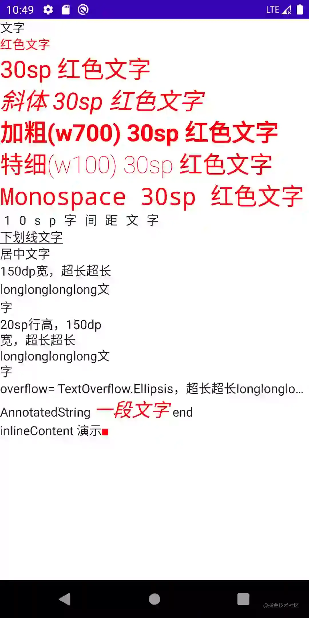
考虑到阅读体验,代码请移步WorkShop
TextField
Android中有 EditText 控件,用于接收 用户的文本输入,Compose中为 TextField
和 TextField 类似的还有 OutlinedTextField,使用上和 TextField 一致,多一个描边外框效果
方法原型:
fun TextField(
    value: String,
    onValueChange: (String) -> Unit,
    modifier: Modifier = Modifier,
    enabled: Boolean = true,
    readOnly: Boolean = false,
    textStyle: TextStyle = LocalTextStyle.current,
    label: @Composable (() -> Unit)? = null,
    placeholder: @Composable (() -> Unit)? = null,
    leadingIcon: @Composable (() -> Unit)? = null,
    trailingIcon: @Composable (() -> Unit)? = null,
    isError: Boolean = false,
    visualTransformation: VisualTransformation = VisualTransformation.None,
    keyboardOptions: KeyboardOptions = KeyboardOptions.Default,
    keyboardActions: KeyboardActions = KeyboardActions(),
    singleLine: Boolean = false,
    maxLines: Int = Int.MAX_VALUE,
    interactionSource: MutableInteractionSource = remember { MutableInteractionSource() },
    shape: Shape =
        MaterialTheme.shapes.small.copy(bottomEnd = ZeroCornerSize, bottomStart = ZeroCornerSize),
    colors: TextFieldColors = TextFieldDefaults.textFieldColors()
)
fun TextField(
    value: TextFieldValue,
    onValueChange: (TextFieldValue) -> Unit,
    modifier: Modifier = Modifier,
    enabled: Boolean = true,
    readOnly: Boolean = false,
    textStyle: TextStyle = LocalTextStyle.current,
    label: @Composable (() -> Unit)? = null,
    placeholder: @Composable (() -> Unit)? = null,
    leadingIcon: @Composable (() -> Unit)? = null,
    trailingIcon: @Composable (() -> Unit)? = null,
    isError: Boolean = false,
    visualTransformation: VisualTransformation = VisualTransformation.None,
    keyboardOptions: KeyboardOptions = KeyboardOptions.Default,
    keyboardActions: KeyboardActions = KeyboardActions(),
    singleLine: Boolean = false,
    maxLines: Int = Int.MAX_VALUE,
    interactionSource: MutableInteractionSource = remember { MutableInteractionSource() },
    shape: Shape =
        MaterialTheme.shapes.small.copy(bottomEnd = ZeroCornerSize, bottomStart = ZeroCornerSize),
    colors: TextFieldColors = TextFieldDefaults.textFieldColors()
)
很巧,和Text类似,除了value 和 onValueChange 的类型不一致,其他均一致。
简单追溯代码后可以发现:
- 和Android不一致,它并没有依赖Text的实现,而Android中 Edittext 继承自 TextView
- TextField 同样是结合
较为通用的设计组合而成的一个控件,并不仅仅只有文字相关部分
本篇注重于学习如何使用,故而略去源码部分
参数含义:
value: TextFieldValue
输入框中要显示的文本,包含了输入框编辑状态的信息,这个功能很强大,可以用来更新文本,光标等,然后还可以从其他位置直接观察到这些值的变化。也就是相当于双向绑定的意思;
- value: 显示的文本
- onValueChange: 更新后的回调
- modifier:修饰器
- enabled:是否可用,如果为false,将不可选中,不可输入,呈现出禁用状态
- readOnly:是否只读,如果是true,则不可编辑,但是可以选中,可以触发复制
- textStyle: 文字样式,前文中Text的诸多参数亦用于构建TextStyle
- label: 显示在文本字段内的可选标签,未获得焦点时呈现
- placeholder: 获得焦点时的默认呈现 类似Tint的效果
- leadingIcon: 输入框前部的图标;
- trailingIcon: 输入框后部的图标;
- isError: 输入内容是否错误,如果为true,则label,Icon等会相应的展示错误的显示状态;
- visualTransformation: 内容显示转变,例如输入密码时可以变成特定效果
- keyboardOptions: 软件键盘选项
- keyboardActions: ImeAction
- singleLine: 是否单行输入
- maxLines:最大行数,需要≥1。如果将singleLine设置为true,则将忽略此参数,
- interactionSource: 目前的知识体系暂不深入
- shape: 输入框的形状
- colors: 各种状态下的颜色 类似Android的ColorStateList
效果演示
TextField(
    value = "文字",
    onValueChange = {

    }
)
如果我们测试这样一段代码,会发现无论输入什么,显示内容都不会改变。Compose 需要我们在外部维护状态
一个有效的输入框代码示例:
var text by rememberSaveable { mutableStateOf("文字") }
TextField(
    value = text,
    onValueChange = {
        text = it
    }
)
如果读者仔细的观察一下,会发现这里的value 依旧对应 String 类型!这里充分利用了Delegate的特性!!
接下来,我们尝试一下几个有趣的属性。
而下述的一些简单属性,相信读者已经心中有数,就不在WorkShop中演示了:
- modifier
- enabled
- readOnly
- textStyle
- visualTransformation
- singleLine
- maxLines
- shape
- colors
label & placeholder
var text by rememberSaveable { mutableStateOf("") }
TextField(
    value = text,
    onValueChange = { text = it },
    label = { Text("Label") },
    placeholder = { Text("PlaceHolder") }
)
未获得焦点时,显示label:这里输入的是啥,获取焦点后,label缩小,如果没有初始值,则显示PlaceHolder,否则初始文字
PlaceHolder:输入示例
效果在章节末呈现
leadingIcon&trailingIcon
var text by rememberSaveable { mutableStateOf("") }

TextField(
    value = text,
    onValueChange = { text = it },
    placeholder = { Text("PlaceHolder") },
    leadingIcon = { Icon(Icons.Filled.Favorite, contentDescription = "Favorite") },
    trailingIcon = { Icon(Icons.Filled.Clear, contentDescription = "Clear",modifier = Modifier.clickable {
        text = ""
    }) }
)
如果在Android原生SDK下,做法可以是:
- 完全自定义View – 完全通过继承
- 继承ViewGroup或者特定ViewGroup,内部通过组合控件方式 反射xml布局或者代码构建 实现逻辑 – 继承 + 组合
- 定义类,内部通过组合控件方式 反射xml布局或者代码构建 实现逻辑 – 组合
每种做法都有自身的优势和劣势,但代码量都会很多
这个例子下我们还无法去讨论
组合与继承的优劣对比,但代码量的感性对比非常明显
isError & keyboardActions & 输入校验
var text by rememberSaveable { mutableStateOf("") }
var isError by rememberSaveable { mutableStateOf(false) }

fun validate(text: String) {
    isError = text.count() < 5
}

TextField(
    value = text,
    onValueChange = {
        text = it
        isError = false
    },
    singleLine = true,
    label = { Text(if (isError) "Email*" else "Email") },
    isError = isError,
    keyboardActions = KeyboardActions { validate(text) },
    modifier = Modifier.semantics {
        // Provide localized description of the error
        if (isError) {
            Toast.makeText(this@P26TextFieldSample,"输入错误",Toast.LENGTH_SHORT).show()
        }
    }
)
代码含义清晰明了
上述例子的效果
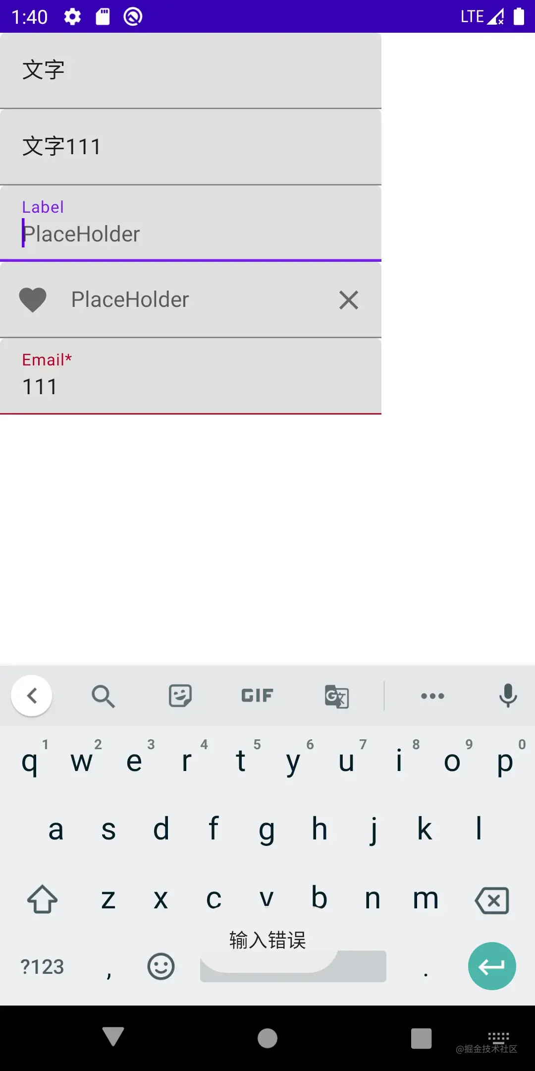
读者可以clone项目后自行体验
相信有读者已经在思考Compose是如何实现
双向绑定的了,按照我们的学习计划,这将在后续的文章中展开。
Button
相信看到这里,有读者已经在思考一个问题了:
Modifier 中有点击相关的内容,为什么还需要有Button呢?它真的是一个视图控件吗?还是一个特定的、带有点击效果的样式组合?
其实 Button 在人机交互中,是一个类似 隐喻 的存在,指代点击可触发特定行为的交互区,在设计发展中,
逐渐形成了一些约定:
- 可触发和不可触发的状态要可识别
- 从其所在环境中可以被轻易地识别出来
- 点击或者按压要有视觉反馈效果
所以样式上是一个不可忽略的侧重点。但是也要客观的承认一点:中式UI和欧美UI确实不是一个风格,所以多数情况下我们会修改掉默认效果。
看一下方法原型:
fun Button(
    onClick: () -> Unit,
    modifier: Modifier = Modifier,
    enabled: Boolean = true,
    interactionSource: MutableInteractionSource = remember { MutableInteractionSource() },
    elevation: ButtonElevation? = ButtonDefaults.elevation(),
    shape: Shape = MaterialTheme.shapes.small,
    border: BorderStroke? = null,
    colors: ButtonColors = ButtonDefaults.buttonColors(),
    contentPadding: PaddingValues = ButtonDefaults.ContentPadding,
    content: RowScope.() -> Unit
): @Composable Unit
- onClick: 点击事件回调
- modifier: 修饰器
- enabled:是否可点击触发
- interactionSource:
- elevation: z轴投影效果
- shape: button和投影的形状
- border: 描边
- colors: 背景色、内容色、各个状态配色
- contentPadding: 容器和内容的间距
- content: 内容
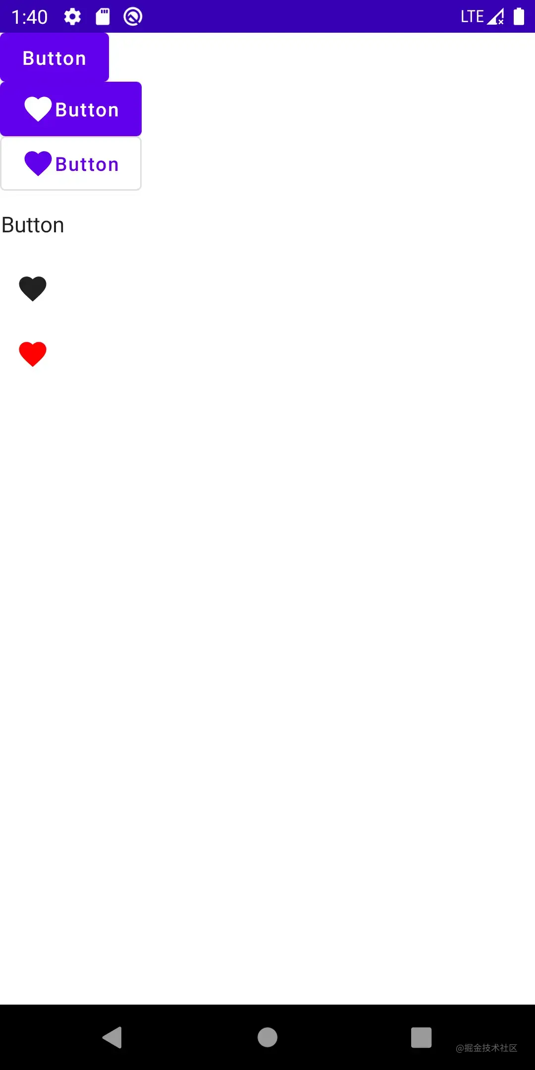
代码示例
一个最简单的文字按钮:
Button(
    onClick = {
        toast("onClick")
    },
    modifier = Modifier.clickable {
        toast("Modifier.onClick")
    }
) {
    Text(
        text = "Button",
    )
}
显然,点击生效的是 onClick 的回调函数。
在 后面的效果图 或者 运行WorkShop后 可发现,这个文字Button已经运用了许多样式
Button的样式部分,读者可自行编码探索实践一二,可以很轻易的和Android原生内容对应上,不再展开。
前文的方法原型中,content: RowScope.() -> Unit 显然可以包含更多的东西。Row 的布局特性会在后续文章展开
例如:
Button(
    onClick = {
        toast("onClick")
    }
) {
    Icon(
        Icons.Filled.Favorite,
        contentDescription = "Favorite"
    )
    Text(
        text = "Button",
    )
}
可以在文字左边放置一个 Favorite 图标
结合样式的衍生物
而Compose中,还有一些内容,代表着Button的操作含义,但有更特殊的样式含义,例如:
- OutlinedButton:有边线的Button, 但非实质的,借用Android原生的内容比喻:有Stroke效果,无Solid效果
- IconButton:显示一个Icon的button 但编码上未强制约束
- IconToggleButton:两个状态图标的icon,相互切换,例如:收藏、取消收藏,表现含义上有别于
Switch,表现类似无文字的CheckBox
OutlinedButton
fun OutlinedButton(
    onClick: () -> Unit,
    modifier: Modifier = Modifier,
    enabled: Boolean = true,
    interactionSource: MutableInteractionSource = remember { MutableInteractionSource() },
    elevation: ButtonElevation? = null,
    shape: Shape = MaterialTheme.shapes.small,
    border: BorderStroke? = ButtonDefaults.outlinedBorder,
    colors: ButtonColors = ButtonDefaults.outlinedButtonColors(),
    contentPadding: PaddingValues = ButtonDefaults.ContentPadding,
    content: @Composable RowScope.() -> Unit
)
和Button参数含义一致
IconButton
fun IconButton(
    onClick: () -> Unit,
    modifier: Modifier = Modifier,
    enabled: Boolean = true,
    interactionSource: MutableInteractionSource = remember { MutableInteractionSource() },
    content: @Composable () -> Unit
)
参数含义参考Button
适用场景如返回键、关闭按钮等
示例:
IconButton(
    onClick = {
        toast("onClick")
    },
) {
    Icon(
        imageVector = Icons.Filled.Favorite,
        contentDescription = "Favorite"
    )
}
IconToggleButton
fun IconToggleButton(
    checked: Boolean,
    onCheckedChange: (Boolean) -> Unit,
    modifier: Modifier = Modifier,
    enabled: Boolean = true,
    interactionSource: MutableInteractionSource = remember { MutableInteractionSource() },
    content: @Composable () -> Unit
)
- checked:默认状态
- onCheckedChange:状态变化后的回调
适用场景如:收藏、取消收藏等
示例:
val checkedState = remember { mutableStateOf(true) }

IconToggleButton(
    checked = checkedState.value,
    onCheckedChange = {
        checkedState.value = it
    },
) {
    Icon(
        imageVector = Icons.Filled.Favorite,
        contentDescription = "Favorite",
        tint = if (checkedState.value) {
            Color.Red
        } else {
            Color.Gray
        }
    )
}
上述所有内容的效果:
结语
在本篇文章中,我们一起学习了Compose的部分基础内容,这些内容学起来也比较枯燥,但适应了Compose之后,学习这些基础内容就会越来越快。
读者可以结合 WorkShop 实践一波,加深印象!
我们下一篇见。